import pandas as pd
import numpy as np
import matplotlib.pyplot as plt
import seaborn as sns
%matplotlib inline10 Advanced Data Visualization
In the previous chapter, we explored basic plotting techniques using Pandas, Seaborn, and Matplotlib to create visualizations. Now, we’ll elevate our skills by diving into more advanced topics, such as crafting complex subplots and visualizing geospatial data, enabling us to build richer and more insightful plots.
To get started, let’s import necessary libraries.
10.1 Matplotlib Plotting Interfaces
10.1.1 Pyplot interface and OOP Interface
There are two types of interfaces in Matplotlib for visualization and these are given below:

10.1.2 Plot a simple figure using two interfaces
gdp_data = pd.read_csv('datasets/gdp_lifeExpectancy.csv')
gdp_data.head()| country | continent | year | lifeExp | pop | gdpPercap | |
|---|---|---|---|---|---|---|
| 0 | Afghanistan | Asia | 1952 | 28.801 | 8425333 | 779.445314 |
| 1 | Afghanistan | Asia | 1957 | 30.332 | 9240934 | 820.853030 |
| 2 | Afghanistan | Asia | 1962 | 31.997 | 10267083 | 853.100710 |
| 3 | Afghanistan | Asia | 1967 | 34.020 | 11537966 | 836.197138 |
| 4 | Afghanistan | Asia | 1972 | 36.088 | 13079460 | 739.981106 |
#Object-oriented interface
fig, ax = plt.subplots() #Create a figure and an axes
x = gdp_data.gdpPercap
y = gdp_data.lifeExp
ax.plot(x,y,'o') #Plot data on the axes
ax.set_xlabel('GDP per capita') #Add an x-label to the axes
ax.set_ylabel('Life expectancy') #Add a y-label to the axes
ax.set_title('Life expectancy vs GDP per capita from 1952 to 2007');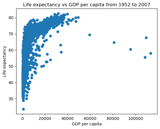
#pyplot interface
x = gdp_data.gdpPercap
y = gdp_data.lifeExp
plt.plot(x,y,'o') #By default, the plot() function makes a lineplot. The 'o' arguments specifies a scatterplot
plt.xlabel('GDP per capita') #Labelling the horizontal X-axis
plt.ylabel('Life expectancy') #Labelling the verical Y-axis
plt.title('Life expectancy vs GDP per capita from 1952 to 2007');
10.1.3 Pyplot Interface
In the previous chapter, our plotting is completely based on pyplot interface of Matplotlib, which is just for basic plotting. You can easily generate plots using pyplot module in the matplotlib library just by importing matplotlib.pyplot module.
- pyplot interface is a state-based interface. It implicitly tracks the plot that it wants to reference
- Simple functions are used to add plot elements and/or modify the plot as we need, whenever we need it.
- The Pyplot interface shares a lot of similarities in syntax and methodology with MATLAB.
However, The pyplot interface has limited functionality in these two cases:
- when there is a need to make multiple plots
- when we have to make plots that require a lot of customization.
For more advanced plotting with Matplotlib, you have to learn Object-Oriented Interface.
10.2 Plotting with Object-Oriented Interface of Matplotlib
10.2.1 Understanding Matplotlib Object Hierarchy
To understand the object-oriented interface of Matplotlib, we have to start with a couple of fundamental concepts related to a plot.
- Figure
- Axes
Think of the entire plot as an object hierarchy with Figure at the top of it. Here is a small subset of the hierarchy with Figure being at the top, followed by Axes ( not the same as axis ), followed by different texts on the plot, different kinds of plots it can handle, the different axis and so on. The hierarchy doesn’t stop there. Further to x-axis for example, there are ticks and further to ticks there are its subsequent properties and so on.

10.2.1.1 Figure
The outermost object is the figure which is an instance of figure.Figure. It is the top level container for all the plot elements. The Figure is the final image that may contain one or more Axes and it keeps track of all the Axes. Figure is only a container and you can not plot data on figure.
# To begin with, we create a fiture instance which provides an empty canvas
fig = plt.figure()<Figure size 640x480 with 0 Axes>Figure is just a container, note that creating figure using plt.figure() does not automatically create an axes and hence all you can see is the figure object.
10.2.1.2 Axes
Axes is the instance of matplotlib.axes.Axes. Axes is the area on which data are plotted. A given figure can contain many Axes, but a given Axes object can only be in one Figure.
10.2.1.2.1 Creating an Axes Object Explicitly
In the OOP interface, Axes objects are usually created using plt.subplots() or plt.figure().add_subplot().
# A figure only contains one axes by default
fig = plt.figure()
# add axes to the figure
ax = fig.add_subplot()
We create a blank axes (area) for plotting, if we need to add more axes to the figure
# create a figure with 4 axes, arranged in 2 rows and 2 columns
fig, axes = plt.subplots(2, 2)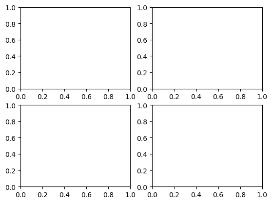
10.2.1.2.2 Components of an Axes Object
The Axes object contains several elements that make up the plot
- Data plotting area: Contains the data (lines, bars, points, etc.).
- X-axis and Y-axis: Controls the axis limits, labels, and ticks.
- Title and Labels: The overall title and labels for each axis.
- Gridlines: Optional lines to help align the data visually.
- Spines: The borders around the plot.
- Legend: An optional component to explain the data series.
- Annotations: Text or arrows highlighting points of interest.
This is what makes the Axes object central to any plot in the OOP interface of Matplotlib.
# create data for plotting
x = np.arange(10)
y = x**2
# create a figure and axes
fig,ax = plt.subplots(1,1)
# plot the data
ax.plot(x,y)
# set the title
ax.set_title("Exponential Plot")
# set the labels of x and y axes
ax.set_xlabel("age")
ax.set_ylabel("Cell growth")
# set the limits of x and y axes
ax.set_xlim([0, 10])
ax.set_ylim([0, 100])
# set the ticks of x and y axes
ax.set_xticks(range(0, 11, 2))
ax.set_yticks(range(0, 101, 20))
# add grid
ax.grid(True)
# add legend
ax.legend(["y = x^2"], loc = "upper left")
# show the plot
plt.show()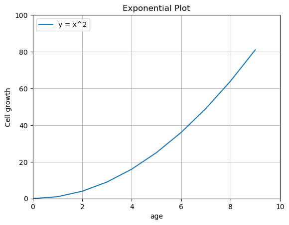
10.2.2 Creating Complex Plots with Multiple Subplots
To help illustrate subplots in matplotlib, we can cover two scenarios:
- subplots that don’t overlap and
- subplots inside other subplots
10.2.2.1 Plotting non-overlapped subplots
This is the most common use case, where multiple plots are placed next to each other in a grid, without overlap. The plt.subplots() function allows for a clean layout where each plot is contained in its own space. You can specify the number of rows and columns to create a grid of subplots.
flowers_df = sns.load_dataset('iris')
tips_df = sns.load_dataset('tips')
flights_df = sns.load_dataset("flights").pivot(index="month", columns="year", values="passengers")
fig, axes = plt.subplots(2, 2, figsize=(10, 6))
# Pass the axes into seaborn
axes[0,0].set_title('Sepal Length vs. Sepal Width')
sns.scatterplot(x=flowers_df.sepal_length,
y=flowers_df.sepal_width,
hue=flowers_df.species,
s=100,
ax=axes[0,0])
# Use the axes for plotting
axes[0,1].set_title('Distribution of Sepal Width')
sns.histplot(flowers_df.sepal_width, ax=axes[0,1])
axes[0,1].legend(['Setosa', 'Versicolor', 'Virginica'])
# Pass the axes into seaborn
axes[1,0].set_title('Restaurant bills')
sns.barplot(x='day', y='total_bill', hue='sex', data=tips_df, ax=axes[1,0])
# Pass the axes into seaborn
axes[1,1].set_title('Flight traffic')
sns.heatmap(flights_df, cmap='Blues', ax=axes[1,1])
plt.tight_layout(pad=2)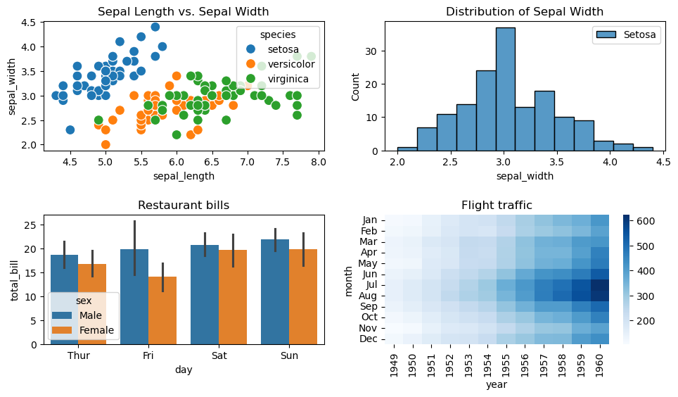
- The
plt.tight_layout()ensures the subplots do not overlap by adjusting the spacing automatically. - Seaborn and pandas are wrappers of Matplotlib. To create a Seaborn/pandas plot in a specific Matplotlib subplot, you pass the
axparameter to the its plotting function. This allows you to use their visualization capabilities while fully controlling the layout of the plot using Matplotlib’splt.subplots()
10.2.2.2 Plotting Nested Subplots (Subplots Inside Other Subplots)
You can create a subplot inside another plot using add_axes() or inset_axes() from matplotlib’s Axes object. This is useful for creating insets or focusing on a specific region within a larger plot.
Syntax of add_axes()
ax = fig.add_axes([left, bottom, width, height])
where
- left: The x-position (horizontal starting point) of the axes, as a fraction of the figure width (0 to 1).
- bottom: The y-position (vertical starting point) of the axes, as a fraction of the figure height (0 to 1).
- width: The width of the axes, as a fraction of the figure width (0 to 1).
- height: The height of the axes, as a fraction of the figure height (0 to 1).
Below is an example demonstrating the use of add_axes(). You can also explore the inset_axes() method for creating inset plots with more flexibility
# create inset axes within the main plot axes
np.random.seed(19680801) # Fixing random state for reproducibility.
# create some data to use for the plot
dt = 0.001
t = np.arange(0.0, 10.0, dt)
r = np.exp(-t[:1000] / 0.05) # impulse response
x = np.random.randn(len(t))
s = np.convolve(x, r)[:len(x)] * dt # colored noise
fig, main_ax = plt.subplots()
main_ax.plot(t, s)
main_ax.set_xlim(0, 1)
main_ax.set_ylim(1.1 * np.min(s), 2 * np.max(s))
main_ax.set_xlabel('time (s)')
main_ax.set_ylabel('current (nA)')
main_ax.set_title('Gaussian colored noise')
# this is an inset axes over the main axes
right_inset_ax = fig.add_axes([.65, .6, .2, .2], facecolor='k')
right_inset_ax.hist(s, 400, density=True)
right_inset_ax.set(title='Probability', xticks=[], yticks=[])
# this is another inset axes over the main axes
left_inset_ax = fig.add_axes([.2, .6, .2, .2], facecolor='k')
left_inset_ax.plot(t[:len(r)], r)
left_inset_ax.set(title='Impulse response', xlim=(0, .2), xticks=[], yticks=[])
plt.show()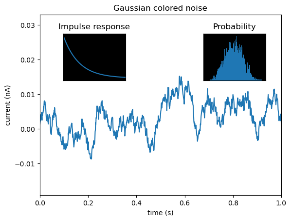
10.2.3 Advanced Customization with Matplotlib’s Object-Oriented Interface
Below, we are reading the dataset of noise complaints of type Loud music/Party received the police in New York City in 2016.
nyc_party_complaints = pd.read_csv('datasets/party_nyc.csv')
nyc_party_complaints.head()| Created Date | Closed Date | Location Type | Incident Zip | City | Borough | Latitude | Longitude | Hour_of_the_day | Month_of_the_year | |
|---|---|---|---|---|---|---|---|---|---|---|
| 0 | 12/31/2015 0:01 | 12/31/2015 3:48 | Store/Commercial | 10034.0 | NEW YORK | MANHATTAN | 40.866183 | -73.918930 | 0 | 12 |
| 1 | 12/31/2015 0:02 | 12/31/2015 4:36 | Store/Commercial | 10040.0 | NEW YORK | MANHATTAN | 40.859324 | -73.931237 | 0 | 12 |
| 2 | 12/31/2015 0:03 | 12/31/2015 0:40 | Residential Building/House | 10026.0 | NEW YORK | MANHATTAN | 40.799415 | -73.953371 | 0 | 12 |
| 3 | 12/31/2015 0:03 | 12/31/2015 1:53 | Residential Building/House | 11231.0 | BROOKLYN | BROOKLYN | 40.678285 | -73.994668 | 0 | 12 |
| 4 | 12/31/2015 0:05 | 12/31/2015 3:49 | Residential Building/House | 10033.0 | NEW YORK | MANHATTAN | 40.850304 | -73.938516 | 0 | 12 |
Below, we will begin with basic plotting, utilizing Matplotlib’s object-oriented interface to handle more complex tasks, such as setting the major axis formatting. When it comes to advanced customization, Matplotlib’s object-oriented interface offers greater flexibility and control compared to the pyplot interface.
10.2.3.1 Bar plots with Pandas
Purpose of bar plots: Barplots are used to visualize any aggregate statistics of a continuous variable with respect to the categories or levels of a categorical variable.
Bar plots can be made using the pandas bar function with the DataFrame or Series, just like the line plots and scatterplots.
Let us visualise the locations from where the the complaints are coming.
ax = nyc_party_complaints['Location Type'].value_counts().plot.bar(ylabel = 'Number of complaints')
ax.yaxis.set_major_formatter('{x:,.0f}')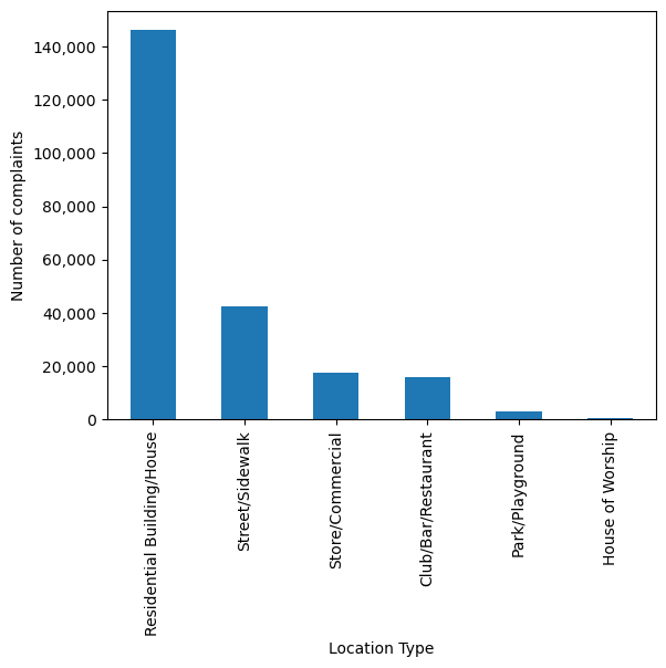
In the above code, we use ax.yaxis.set_major_formatter to format the y-axis labels in a currency style. From the above plot, we observe that most of the complaints come from residential buildings and houses, as one may expect.
For categorical variables, we can use the .value_counts() method to get the statistical frequency of each unique value.
nyc_party_complaints['Location Type'].value_counts()Location Type
Residential Building/House 146040
Street/Sidewalk 42353
Store/Commercial 17617
Club/Bar/Restaurant 15766
Park/Playground 3036
House of Worship 602
Name: count, dtype: int64Next, Let is visualize the time of the year when most complaints occur.
nyc_party_complaints['Month_of_the_year'].value_counts()Month_of_the_year
6 25933
5 25192
9 25000
7 24502
8 20833
10 19332
4 17718
12 15730
11 14146
3 13880
1 12171
2 10977
Name: count, dtype: int64#Using the pandas function bar() to create bar plot
ax = nyc_party_complaints['Month_of_the_year'].value_counts().sort_index().plot.bar(ylabel = 'Number of complaints',
xlabel = "Month")
ax.yaxis.set_major_formatter('{x:,.0f}')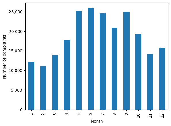
Try executing the code without sort_index() to figure out the purpose of using the function.
From the above plot, we observe that most of the complaints occur during summer and early Fall.
Let us create a stacked bar chart that combines both the above plots into a single plot. You may ignore the code used for re-shaping the data until Chapter 10. The purpose here is to show the utility of the pandas bar() function.
#Reshaping the data to make it suitable for a stacked barplot - ignore this code until chapter 8
complaints_location=pd.crosstab(nyc_party_complaints.Month_of_the_year, nyc_party_complaints['Location Type'])
complaints_location.head()| Location Type | Club/Bar/Restaurant | House of Worship | Park/Playground | Residential Building/House | Store/Commercial | Street/Sidewalk |
|---|---|---|---|---|---|---|
| Month_of_the_year | ||||||
| 1 | 748 | 24 | 17 | 9393 | 1157 | 832 |
| 2 | 570 | 29 | 16 | 8383 | 1197 | 782 |
| 3 | 747 | 39 | 90 | 9689 | 1480 | 1835 |
| 4 | 848 | 53 | 129 | 11984 | 1761 | 2943 |
| 5 | 2091 | 72 | 322 | 15676 | 1941 | 5090 |
#Stacked bar plot showing number of complaints at different months of the year, and from different locations
ax = complaints_location.plot.bar(stacked=True,ylabel = 'Number of complaints',figsize=(15, 10), xlabel = 'Month')
ax.tick_params(axis = 'both',labelsize=15)
ax.yaxis.set_major_formatter('{x:,.0f}')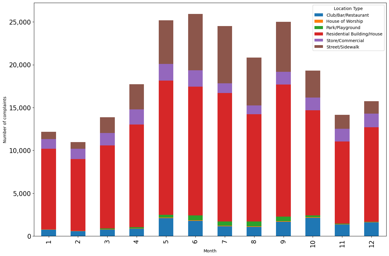
The above plots gives the insights about location and day of the year simultaneously that were previously separately obtained by the individual plots.
An alternative to stacked barplots are side-by-side barplots, as shown below.
#Side-by-side bar plot showing number of complaints at different months of the year, and from different locations
ax = complaints_location.plot.bar(ylabel = 'Number of complaints',figsize=(15, 10), xlabel = 'Month')
ax.tick_params(axis = 'both',labelsize=15)
ax.yaxis.set_major_formatter('{x:,.0f}')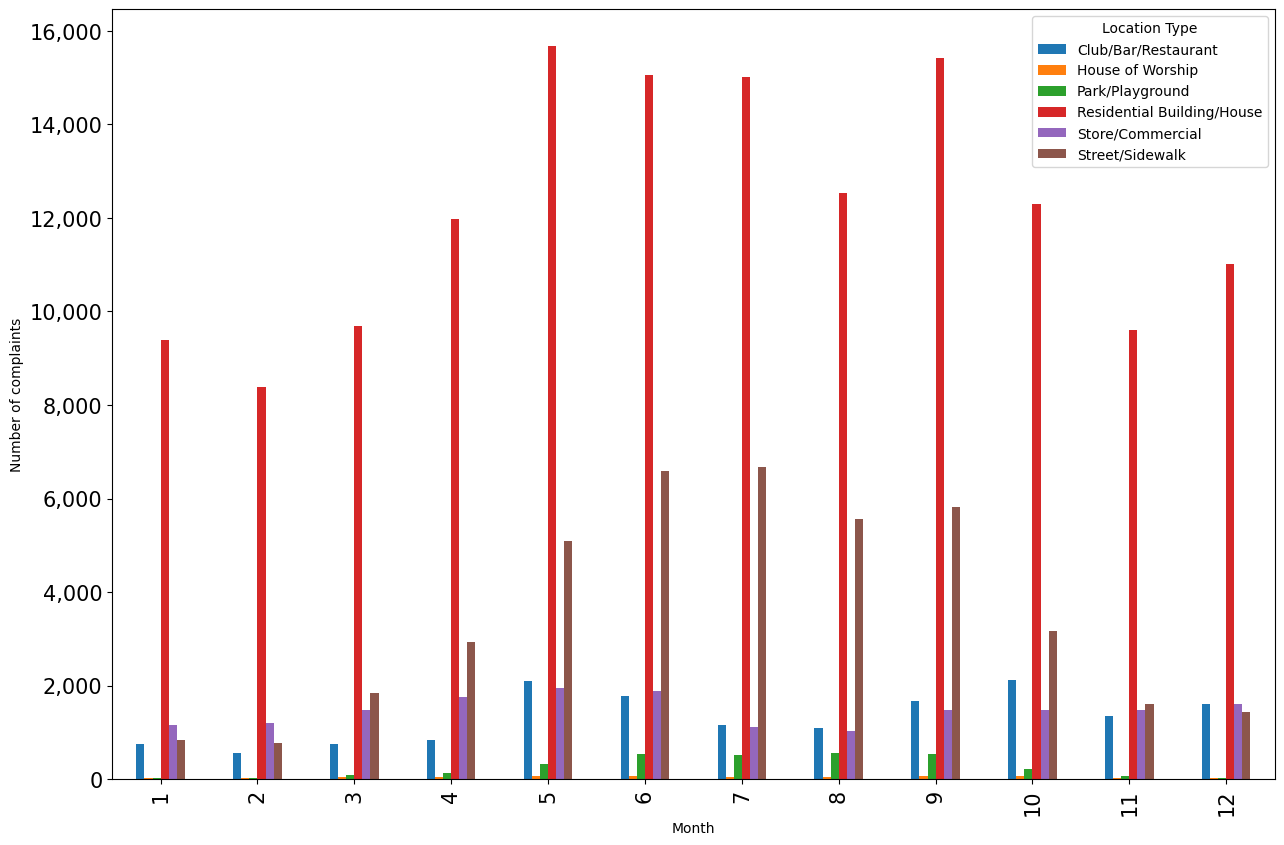
Question: In which scenarios should we use a stacked barplot instead of a side-by-side barplot and vice-versa?
10.2.3.2 Bar plots with confidence intervals with Seaborn
We’ll group the data to obtain the total complaints for each Location Type, Borough, Month_of_the_year, and Hour_of_the_day. Note that you’ll learn grouping data in later chapters, so you may ignore the next code block. The grouping is done to shape the data in a suitable form for visualization.
#Grouping the data to make it suitable for visualization using Seaborn. Ignore this code block until learn chapter 9.
nyc_complaints_grouped = nyc_party_complaints[['Location Type','Borough','Month_of_the_year','Latitude','Hour_of_the_day']].groupby(['Location Type','Borough','Month_of_the_year','Hour_of_the_day'])['Latitude'].agg([('complaints','count')]).reset_index()
nyc_complaints_grouped.head()| Location Type | Borough | Month_of_the_year | Hour_of_the_day | complaints | |
|---|---|---|---|---|---|
| 0 | Club/Bar/Restaurant | BRONX | 1 | 0 | 10 |
| 1 | Club/Bar/Restaurant | BRONX | 1 | 1 | 10 |
| 2 | Club/Bar/Restaurant | BRONX | 1 | 2 | 6 |
| 3 | Club/Bar/Restaurant | BRONX | 1 | 3 | 6 |
| 4 | Club/Bar/Restaurant | BRONX | 1 | 4 | 3 |
Let us create a bar plot visualizing the average number of complaints with the time of the day.
ax = sns.barplot(x="Hour_of_the_day", y = 'complaints', data=nyc_complaints_grouped)
ax.figure.set_figwidth(15)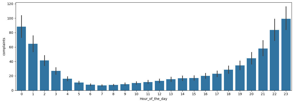
From the above plot, we observe that most of the complaints are made around midnight. However, interestingly, there are some complaints at each hour of the day.
Note that the above barplot shows the mean number of complaints in a month at each hour of the day. The black lines are the 95% confidence intervals of the mean number of complaints.
10.2.4 pyplot: a convenience wrapper around the object-oriented interface
While the pyplot interface is simpler for quick, basic plots, it ultimately wraps around the object-oriented structure of Matplotlib, meaning that it’s built on top of the object-oriented interface.

10.3 Creating Subplots with Seaborn
We previously demonstrated how Seaborn integrates seamlessly with Matplotlib’s object-oriented interface, allowing you to pass the ax argument to any Seaborn function, thereby directing the plot to a specific axis within a subplot grid.
Additionally, Seaborn offers a more convenient and simplified approach to creating subplots, thanks to its high-level functions and built-in integration with Matplotlib. Here’s how Seaborn makes working with subplots easier:
10.3.1 Using Facetgrid
Seaborn’s FacetGrid function make it very easy to create facet grids or subplots based on data dimensions (such as categories), which would require more manual effort with Matplotlib.
You can use the row and col parameters to control how the data is split into subplots along these dimensions.
# Seaborn Example using FacetGrid:
tips_df = sns.load_dataset("tips")
tips_df.head()| total_bill | tip | sex | smoker | day | time | size | |
|---|---|---|---|---|---|---|---|
| 0 | 16.99 | 1.01 | Female | No | Sun | Dinner | 2 |
| 1 | 10.34 | 1.66 | Male | No | Sun | Dinner | 3 |
| 2 | 21.01 | 3.50 | Male | No | Sun | Dinner | 3 |
| 3 | 23.68 | 3.31 | Male | No | Sun | Dinner | 2 |
| 4 | 24.59 | 3.61 | Female | No | Sun | Dinner | 4 |
g = sns.FacetGrid(tips_df, col='time', row='smoker')
g.map(sns.histplot, 'total_bill', color='r')
g.set_titles(col_template="{col_name}", row_template="Smoker: {row_name}");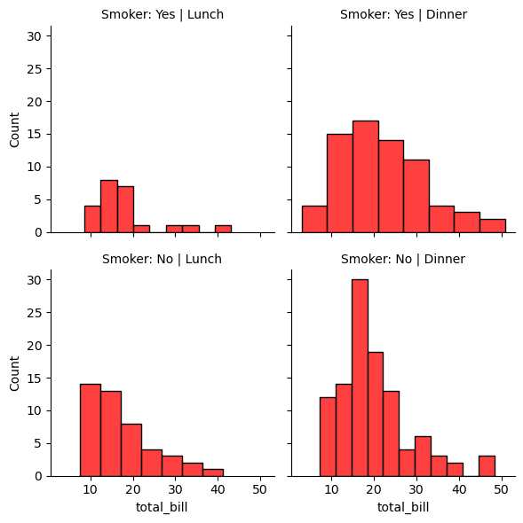
# adding hue to the FacetGrid
g = sns.FacetGrid(tips_df, col='time', row='smoker',hue='size')
# Plot a scatterplot of the total bill and tip for each combination of time and smoker
g.map(sns.scatterplot, 'total_bill', 'tip')
g.set_titles(col_template="{col_name}", row_template="Smoker: {row_name}");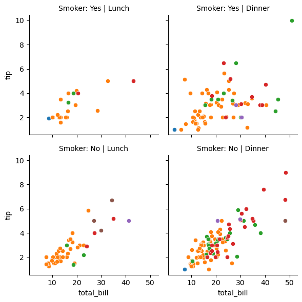
#Visualizing the number of complaints with Month_of_the_year, Location Type, and Borough.
a = sns.FacetGrid(nyc_complaints_grouped, hue = 'Location Type', col = 'Borough',col_wrap=3,height=3.5,aspect = 1)
# Plotting a lineplot to show the number of complaints with Month_of_the_year
a.map(sns.lineplot,'Month_of_the_year','complaints')
a.set_axis_labels("Month of the year", "Complaints")
a.add_legend()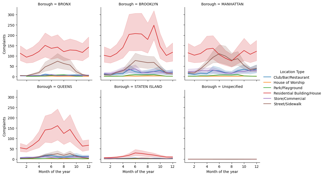
10.3.2 Using Pairplot
Pairplots are used to visualize the association between all variable-pairs in the data. In other words, pairplots simultaneously visualize the scatterplots between all variable-pairs.
Let us visualize the pair-wise association of tips variables in the tips dataset
sns.pairplot(tips_df );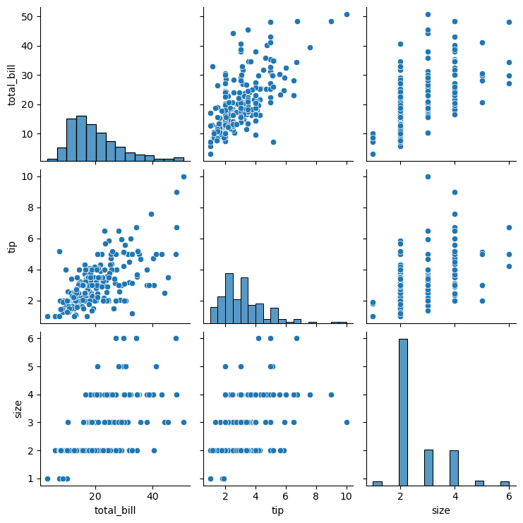
Let us visualize the pair-wise association of nutrition variables in the starbucks drinks data.
starbucks_drinks = pd.read_csv('datasets/starbucks-menu-nutrition-drinks.csv')
sns.pairplot(starbucks_drinks);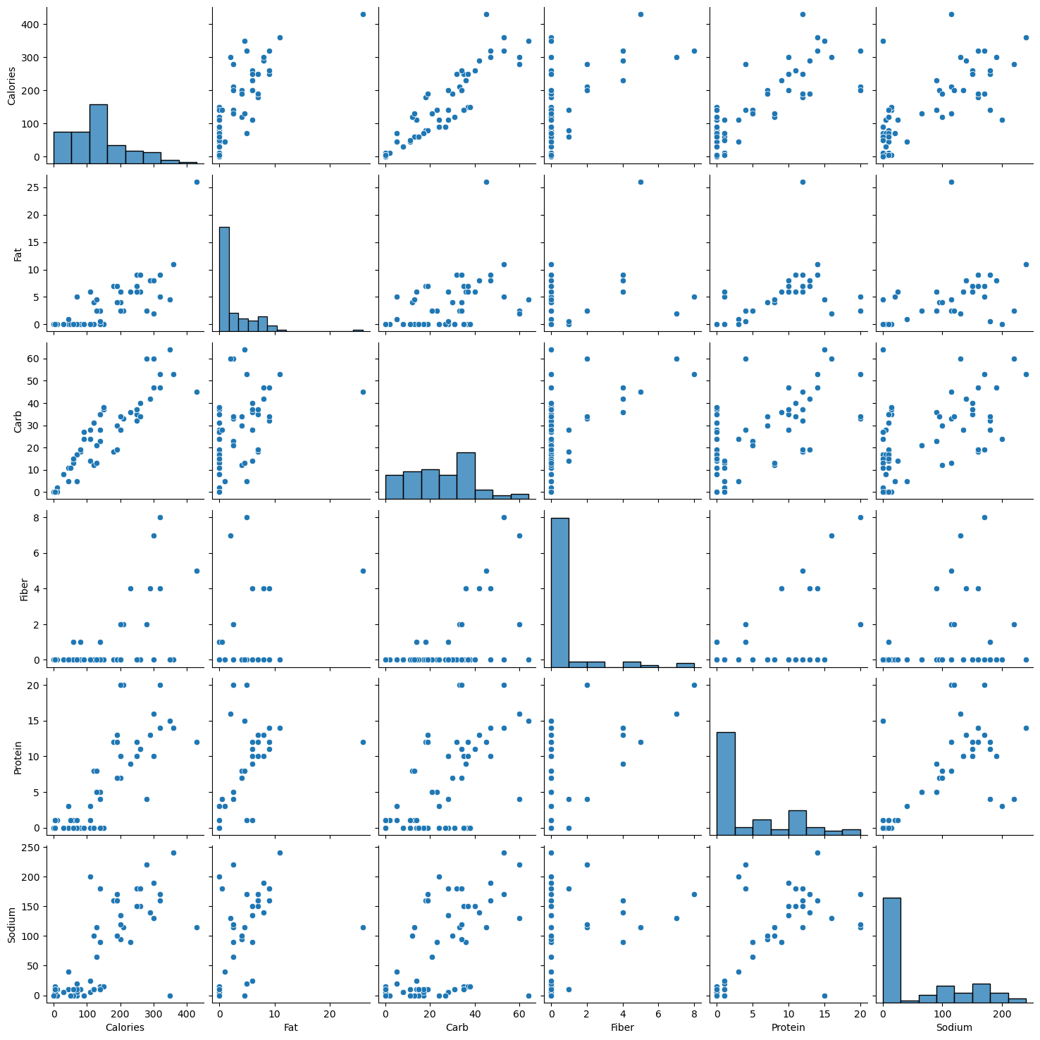
In the above pairplot, note that:
- The histograms on the diagonal of the grid show the distribution of each of the variables.
- Instead of a histogram, we can visualize the density plot with the argument kde = True.
- The scatterplots in the rest of the grid are the pair-wise plots of all the variables.
10.4 Geosptial Plotting
There are several widely used Python packages pecifically designed for working with geospatial datasets. In this lesson, we will cover:
- GeoPandas
- Folium
Let’s import them
import geopandas as gpd
import geopandas
import folium
import geodatasetsc:\Users\lsi8012\AppData\Local\anaconda3\Lib\site-packages\paramiko\transport.py:219: CryptographyDeprecationWarning: Blowfish has been deprecated and will be removed in a future release
"class": algorithms.Blowfish,10.4.1 Static Plots with GeoPandas
A shapefile is a widely-used format for storing geographic information system (GIS) data, specifically vector data. It contains geometries (like points, lines, and polygons) that represent features on the earth’s surface, along with associated attributes for each feature, such as names, populations, or other data relevant to the feature.
10.4.1.1 Components of a Shapefile
A shapefile isn’t a single file but a collection of files with the same name and different extensions, which work together to store geographic and attribute data:
.shp: Stores the geometry (shapes of features, like points, lines, polygons)..shx: Contains an index to quickly access geometries in the .shp file..dbf: A table storing attributes associated with each feature.
There may also be other optional files (e.g., .prj for projection information).
# Create figure and axis
fig, ax = plt.subplots(figsize=(15, 10))
# Plot your GeoDataFrame
chicago = gpd.read_file(r'datasets/chicago_boundaries\geo_export_26bce2f2-c163-42a9-9329-9ca6e082c5e9.shp')
chicago.plot(column='community', ax=ax, legend=True, legend_kwds={'ncol': 2, 'bbox_to_anchor': (2, 1)})
# Add title (optional)
plt.title('Chicago Community Areas');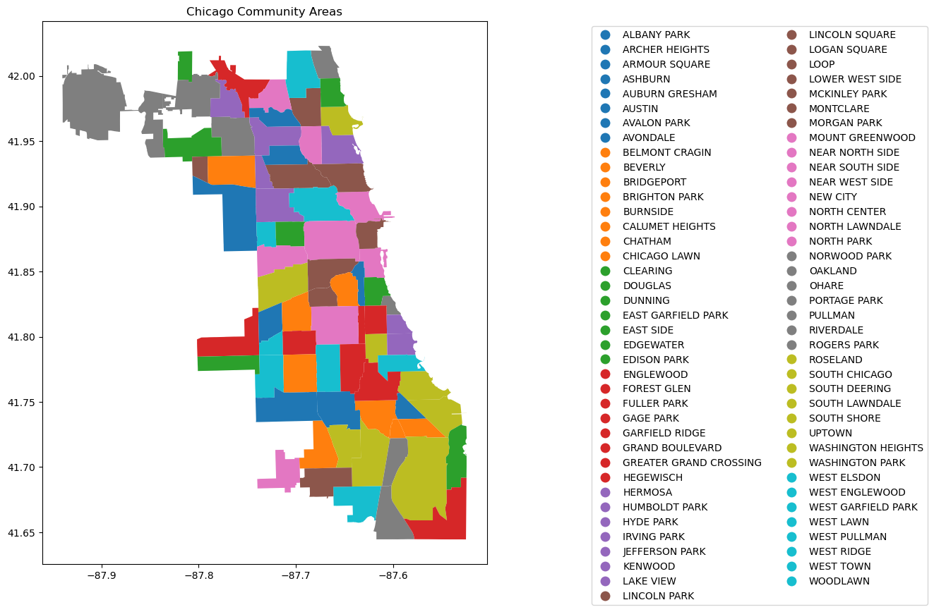
Let’s print out the information in the shapefile
chicago.head()| area | area_num_1 | area_numbe | comarea | comarea_id | community | perimeter | shape_area | shape_len | geometry | |
|---|---|---|---|---|---|---|---|---|---|---|
| 0 | 0.0 | 35 | 35 | 0.0 | 0.0 | DOUGLAS | 0.0 | 4.600462e+07 | 31027.054510 | POLYGON ((-87.60914 41.84469, -87.60915 41.844... |
| 1 | 0.0 | 36 | 36 | 0.0 | 0.0 | OAKLAND | 0.0 | 1.691396e+07 | 19565.506153 | POLYGON ((-87.59215 41.81693, -87.59231 41.816... |
| 2 | 0.0 | 37 | 37 | 0.0 | 0.0 | FULLER PARK | 0.0 | 1.991670e+07 | 25339.089750 | POLYGON ((-87.6288 41.80189, -87.62879 41.8017... |
| 3 | 0.0 | 38 | 38 | 0.0 | 0.0 | GRAND BOULEVARD | 0.0 | 4.849250e+07 | 28196.837157 | POLYGON ((-87.60671 41.81681, -87.6067 41.8165... |
| 4 | 0.0 | 39 | 39 | 0.0 | 0.0 | KENWOOD | 0.0 | 2.907174e+07 | 23325.167906 | POLYGON ((-87.59215 41.81693, -87.59215 41.816... |
chicago['geometry'].head()0 POLYGON ((-87.60914 41.84469, -87.60915 41.844...
1 POLYGON ((-87.59215 41.81693, -87.59231 41.816...
2 POLYGON ((-87.6288 41.80189, -87.62879 41.8017...
3 POLYGON ((-87.60671 41.81681, -87.6067 41.8165...
4 POLYGON ((-87.59215 41.81693, -87.59215 41.816...
Name: geometry, dtype: geometry# Check the column names to see available data fields
print("Columns in the shapefile:", chicago.columns)
# Check the data types of each column
print("Data types:", chicago.dtypes)
# View the spatial extent (bounding box) of the shapes
print("Bounding box:", chicago.total_bounds)
# Check the coordinate reference system (CRS)
print("CRS:", chicago.crs)Columns in the shapefile: Index(['area', 'area_num_1', 'area_numbe', 'comarea', 'comarea_id',
'community', 'perimeter', 'shape_area', 'shape_len', 'geometry'],
dtype='object')
Data types: area float64
area_num_1 object
area_numbe object
comarea float64
comarea_id float64
community object
perimeter float64
shape_area float64
shape_len float64
geometry geometry
dtype: object
Bounding box: [-87.94011408 41.64454312 -87.5241371 42.02303859]
CRS: EPSG:4326To enhance the geospatial plot, we’ll use the shapefile as a background to provide context for Chicago’s community areas. On top of that, we’ll layer points of interest, such as restaurants, and shops, to illustrate the city’s amenities. This approach will make the map more informative and visually engaging, with community boundaries as the foundation and key locations overlayed to highlight areas of interest.
Next, we will add the Divvy bicycle stations on top of the chicago shapefile
10.4.2 Dataset: Bicycle Sharing in Chicago

Divvy is Chicagoland’s bike share system (in collaboration with Chicago Department of Transportation), with 6,000 bikes available at 570+ stations across Chicago and Evanston. Divvy provides residents and visitors with a convenient, fun and affordable transportation option for getting around and exploring Chicago.
Divvy, like other bike share systems, consists of a fleet of specially designed, sturdy and durable bikes that are locked into a network of docking stations throughout the region. The bikes can be unlocked from one station and returned to any other station in the system. People use bike share to explore Chicago, commute to work or school, run errands, get to appointments or social engagements, and more.
Divvy is available for use 24 hours/day, 7 days/week, 365 days/year, and riders have access to all bikes and stations across the system.
We will be using divvy trips in the year of 2013
# read the csv file'divvy_2013.csv' into pandas pandas dataframe
data = pd.read_csv('datasets/divvy_2013.csv')
data.head()| trip_id | usertype | gender | starttime | stoptime | tripduration | from_station_id | from_station_name | latitude_start | longitude_start | ... | dewpoint | humidity | pressure | visibility | wind_speed | precipitation | events | rain | conditions | month | |
|---|---|---|---|---|---|---|---|---|---|---|---|---|---|---|---|---|---|---|---|---|---|
| 0 | 3940 | Subscriber | Male | 2013-06-27 01:06:00 | 2013-06-27 09:46:00 | 31177 | 91 | Clinton St & Washington Blvd | 41.88338 | -87.641170 | ... | 64.9 | 96.0 | 29.75 | 7.0 | 0.0 | -9999.0 | partlycloudy | 0 | Scattered Clouds | 6 |
| 1 | 4095 | Subscriber | Male | 2013-06-27 12:06:00 | 2013-06-27 12:11:00 | 301 | 85 | Michigan Ave & Oak St | 41.90096 | -87.623777 | ... | 69.1 | 55.0 | 29.75 | 10.0 | 13.8 | -9999.0 | mostlycloudy | 0 | Mostly Cloudy | 6 |
| 2 | 4113 | Subscriber | Male | 2013-06-27 11:09:00 | 2013-06-27 11:11:00 | 140 | 88 | May St & Randolph St | 41.88397 | -87.655688 | ... | 70.0 | 61.0 | 29.75 | 10.0 | 10.4 | -9999.0 | mostlycloudy | 0 | Mostly Cloudy | 6 |
| 3 | 4118 | Customer | NaN | 2013-06-27 12:11:00 | 2013-06-27 12:16:00 | 316 | 85 | Michigan Ave & Oak St | 41.90096 | -87.623777 | ... | 69.1 | 55.0 | 29.75 | 10.0 | 13.8 | -9999.0 | mostlycloudy | 0 | Mostly Cloudy | 6 |
| 4 | 4119 | Subscriber | Male | 2013-06-27 11:12:00 | 2013-06-27 11:13:00 | 87 | 88 | May St & Randolph St | 41.88397 | -87.655688 | ... | 70.0 | 61.0 | 29.75 | 10.0 | 10.4 | -9999.0 | mostlycloudy | 0 | Mostly Cloudy | 6 |
5 rows × 28 columns
In the Divvy dataset, each trip record includes the latitude and longitude coordinates of both the pickup and drop-off locations, which correspond to Divvy bike stations. These coordinates allow us to map the precise locations of each station, making it possible to visually display the network of Divvy stations across the city. By plotting these stations on a map, we can better understand the geographic distribution and accessibility of Divvy’s bike-sharing network.
Below are the basic data cleaning steps to extract the coordinates of the Divvy stations.
# drop the duplicates in the column 'to_station_id', 'to_station_name', 'latitude_end', 'longitude_end'
# data_station_same = data[['from_station_id', 'from_station_name', 'latitude_start', 'longitude_start', 'to_station_id', 'to_station_name', 'latitude_end', 'longitude_end']].drop_duplicates()
# data_station_same.shape10.4.3 Adding the divvy station to the plot
Once the coordinates are prepared, we’ll add them as scatter plots on top of the Chicago shapefile
# Adding the stations to the plot
fig, ax = plt.subplots(figsize=(15, 10))
chicago = gpd.read_file(r'datasets/chicago_boundaries\geo_export_26bce2f2-c163-42a9-9329-9ca6e082c5e9.shp')
chicago.plot(column='community', ax=ax, legend=True, legend_kwds={'ncol': 2, 'bbox_to_anchor': (2, 1)})
# Plot the stations
longlat_df = data[[ 'latitude_start', 'longitude_start']].drop_duplicates()
plt.scatter(longlat_df['longitude_start'], longlat_df['latitude_start'], s=10, alpha=0.5, color='black', marker='o')
# Add title (optional)
plt.title('Chicago Community Areas');
10.4.4 Change the chicago shapefile
Using a different Chicago shapefile from GeoDa is a great way to observe how geographic boundaries or data details may vary
chicago = gpd.read_file(geodatasets.get_path("geoda.chicago_commpop"))
# Plot the data
fig, ax = plt.subplots(figsize=(15, 10))
chicago.boundary.plot(ax=ax)
plt.scatter(data['longitude_start'], data['latitude_start'], s=10, alpha=0.5, color='black', marker='o')
plt.title('Chicago Community Areas');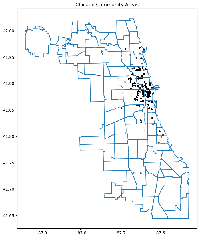
10.4.5 Interactive Plotting
Alongside static plots, geopandas can create interactive maps based on the folium library.
Creating maps for interactive exploration mirrors the API of static plots in an explore() method of a GeoSeries or GeoDataFrame.
Here’s an explanation of how explore() works and its key features:
Key Features of explore():
- Interactive Map Display:
- When you call explore() on a Geodataframe (gdf), it launches an interactive map widget directly within your Jupyter notebook.
- This map allows you to pan, zoom, and interact with the geometries (points, lines, polygons) in your Geodataframe.
- Layer Control:
- explore() automatically adds the geometries from your Geodataframe as layers on the map.
- Each geometry type (points, lines, polygons) is displayed with appropriate styling and markers.
- Tooltip Information:
- When you hover over a geometry in the map, explore() displays tooltip information that typically includes attribute data associated with that geometry.
- This feature is useful for inspecting specific details or properties of individual features in your geospatial dataset.
- Search and Filter:
- explore() provides basic search and filter functionalities directly on the map.
- You can search for specific attribute values or filter the displayed features based on attribute criteria defined in your Geodataframe.
- Customization:
- Although explore() provides default styling and interaction behaviors, you can customize the map further using parameters or by manipulating the Geodataframe before calling explore().
# use the geopandas explore default settings
chicago = gpd.read_file(geodatasets.get_path("geoda.chicago_commpop"))
chicago.explore()Make this Notebook Trusted to load map: File -> Trust Notebook
Adding the population layer
# Customerize the explore settings
chicago = gpd.read_file(geodatasets.get_path("geoda.chicago_commpop"))
m = chicago.explore(
column="POP2010", # make choropleth based on "POP2010" column
scheme="naturalbreaks", # use mapclassify's natural breaks scheme
legend=True, # show legend
k=10, # use 10 bins
tooltip=False, # hide tooltip
popup=["POP2010", "POP2000"], # show popup (on-click)
legend_kwds=dict(colorbar=False), # do not use colorbar
name="chicago", # name of the layer in the map
)
mc:\Users\lsi8012\AppData\Local\anaconda3\Lib\site-packages\sklearn\cluster\_kmeans.py:1446: UserWarning: KMeans is known to have a memory leak on Windows with MKL, when there are less chunks than available threads. You can avoid it by setting the environment variable OMP_NUM_THREADS=1.
warnings.warn(Make this Notebook Trusted to load map: File -> Trust Notebook
The explore() method returns a folium.Map object, which can also be passed directly (as you do with ax in plot()). You can then use folium functionality directly on the resulting map. Next, let’s add the divvy station plot.
type(m)folium.folium.Map10.4.6 Adding the divvy station on the interactive Folium.Map
We need to extract the station information from the trip dataset and add description to the station. You can skip this part
# Helper function for adding the description to the station
def row_to_html(row):
row_df = pd.DataFrame(row).T
row_df.columns = [col.capitalize() for col in row_df.columns]
return row_df.to_html(index=False)# Extracting the latitude, longitude, and station name for plotting, and also counting the number of trips from each station
grouped_df = data.groupby(['from_station_name', 'latitude_start', 'longitude_start'])['trip_id'].count().reset_index()
display(grouped_df.sort_values('trip_id', ascending=False).head())
grouped_df.rename(columns={'from_station_name':'title', 'latitude_start':'latitude', 'longitude_start':'longitude', 'trip_id':'count'}, inplace=True)
grouped_df['description'] = grouped_df.apply(lambda row: row_to_html(row), axis=1)
geometry = gpd.points_from_xy(grouped_df['longitude'], grouped_df['latitude'])
geo_df = gpd.GeoDataFrame(grouped_df, geometry=geometry)
# Optional: Assign Coordinate Reference System (CRS)
geo_df.crs = "EPSG:4326" # WGS84 coordinate system
geo_df.head()| from_station_name | latitude_start | longitude_start | trip_id | |
|---|---|---|---|---|
| 75 | Millennium Park | 41.881032 | -87.624084 | 207 |
| 54 | Lake Shore Dr & Monroe St | 41.881050 | -87.616970 | 191 |
| 72 | Michigan Ave & Oak St | 41.900960 | -87.623777 | 186 |
| 68 | McClurg Ct & Illinois St | 41.891020 | -87.617300 | 177 |
| 73 | Michigan Ave & Pearson St | 41.897660 | -87.623510 | 127 |
| title | latitude | longitude | count | description | geometry | |
|---|---|---|---|---|---|---|
| 0 | Aberdeen St & Jackson Blvd | 41.877726 | -87.654787 | 28 | <table border="1" class="dataframe">\n <thead... | POINT (-87.65479 41.87773) |
| 1 | Aberdeen St & Madison St | 41.881487 | -87.654752 | 28 | <table border="1" class="dataframe">\n <thead... | POINT (-87.65475 41.88149) |
| 2 | Adler Planetarium | 41.866095 | -87.607267 | 6 | <table border="1" class="dataframe">\n <thead... | POINT (-87.60727 41.8661) |
| 3 | Ashland Ave & Armitage Ave | 41.917859 | -87.668919 | 20 | <table border="1" class="dataframe">\n <thead... | POINT (-87.66892 41.91786) |
| 4 | Ashland Ave & Augusta Blvd | 41.899643 | -87.667700 | 27 | <table border="1" class="dataframe">\n <thead... | POINT (-87.6677 41.89964) |
We can add a hover tooltip (sometimes referred to as a tooltip or tooltip popup) for each point on your Folium map. This tooltip will appear when you hover over the markers on the map, providing additional information without needing to click on them. Here’s how you can modify your existing code to include hover tooltips:
chicago = gpd.read_file(geodatasets.get_path("geoda.chicago_commpop"))
m = chicago.explore(
column="POP2010", # make choropleth based on "POP2010" column
scheme="naturalbreaks", # use mapclassify's natural breaks scheme
legend=True, # show legend
k=10, # use 10 bins
tooltip=False, # hide tooltip
popup=["POP2010", "POP2000"], # show popup (on-click)
legend_kwds=dict(colorbar=False), # do not use colorbar
name="chicago", # name of the layer in the map
)
geo_df.explore(
m=m, # pass the map object
color="red", # use red color on all points
marker_kwds=dict(radius=5, fill=True), # make marker radius 10px with fill
tooltip="description", # show "name" column in the tooltip
tooltip_kwds=dict(labels=False), # do not show column label in the tooltip
name="divstation", # name of the layer in the map
)
mc:\Users\lsi8012\AppData\Local\anaconda3\Lib\site-packages\sklearn\cluster\_kmeans.py:1446: UserWarning: KMeans is known to have a memory leak on Windows with MKL, when there are less chunks than available threads. You can avoid it by setting the environment variable OMP_NUM_THREADS=1.
warnings.warn(Make this Notebook Trusted to load map: File -> Trust Notebook
10.5 Independent Study
10.5.1 Multiple plots in a single figure using Seaborn
Purpose: Histogram and density plots visualize the distribution of a continuous variable.
A histogram plots the number of observations occurring within discrete, evenly spaced bins of a random variable, to visualize the distribution of the variable. It may be considered a special case of a bar plot as bars are used to plot the observation counts.
A density plot uses a kernel density estimate to approximate the distribution of random variable.
Using the tips_df dataset
10.5.1.1
Make a histogram showing the distributions of total bill on each day of the week
10.5.1.2
Make a density plot showing the distributions of total bills on each day.