import pandas as pd
import numpy as np
import matplotlib.pyplot as plt
import sklearn as sk
import seaborn as sns

sns.set(font_scale=1.5)

%matplotlib inline11 Data Cleaning and Preparation
11.1 Handling missing data
Missing values in a dataset can occur due to several reasons such as breakdown of measuring equipment, accidental removal of observations, lack of response by respondents, error on the part of the researcher, etc.
Let us read the dataset GDP_missing_data.csv, in which we have randomly removed some values, or put missing values in some of the columns.
We’ll also read GDP_complete_data.csv, in which we have not removed any values. We’ll use this data later to assess the accuracy of our guess or estimate of missing values in GDP_missing_data.csv.
gdp_missing_values_data = pd.read_csv('./Datasets/GDP_missing_data.csv')
gdp_complete_data = pd.read_csv('./Datasets/GDP_complete_data.csv')gdp_missing_values_data.head()| economicActivityFemale | country | lifeMale | infantMortality | gdpPerCapita | economicActivityMale | illiteracyMale | illiteracyFemale | lifeFemale | geographic_location | contraception | continent | |
|---|---|---|---|---|---|---|---|---|---|---|---|---|
| 0 | 7.2 | Afghanistan | 45.0 | 154.0 | 2474.0 | 87.5 | NaN | 85.0 | 46.0 | Southern Asia | NaN | Asia |
| 1 | 7.8 | Algeria | 67.5 | 44.0 | 11433.0 | 76.4 | 26.1 | 51.0 | 70.3 | Northern Africa | NaN | Africa |
| 2 | 41.3 | Argentina | 69.6 | 22.0 | NaN | 76.2 | 3.8 | 3.8 | 76.8 | South America | NaN | South America |
| 3 | 52.0 | Armenia | 67.2 | 25.0 | 13638.0 | 65.0 | NaN | 0.5 | 74.0 | Western Asia | NaN | Asia |
| 4 | 53.8 | Australia | NaN | 6.0 | 54891.0 | NaN | 1.0 | 1.0 | 81.2 | Oceania | NaN | Oceania |
Observe that the gdp_missing_values_data dataset consists of some missing values shown as NaN (Not a Number).
11.1.1 Identifying missing values in a dataframe
There are multiple ways to identify missing values in a dataframe
11.1.1.1 describe() Method
Note that the descriptive statistics methods associated with Pandas objects ignore missing values by default. Consider the summary statistics of gdp_missing_values_data:
gdp_missing_values_data.describe()| economicActivityFemale | lifeMale | infantMortality | gdpPerCapita | economicActivityMale | illiteracyMale | illiteracyFemale | lifeFemale | contraception | |
|---|---|---|---|---|---|---|---|---|---|
| count | 145.000000 | 145.000000 | 145.000000 | 145.000000 | 145.000000 | 145.000000 | 145.000000 | 145.000000 | 84.000000 |
| mean | 45.935172 | 65.491724 | 37.158621 | 24193.482759 | 76.563448 | 13.570028 | 21.448897 | 70.615862 | 51.773810 |
| std | 16.875922 | 9.099256 | 34.465699 | 22748.764444 | 7.854730 | 16.497954 | 25.497045 | 9.923791 | 31.930026 |
| min | 1.900000 | 36.000000 | 3.000000 | 772.000000 | 51.200000 | 0.000000 | 0.000000 | 39.100000 | 0.000000 |
| 25% | 35.500000 | 62.900000 | 10.000000 | 6837.000000 | 72.000000 | 1.000000 | 2.300000 | 67.500000 | 17.000000 |
| 50% | 47.600000 | 67.800000 | 24.000000 | 15184.000000 | 77.300000 | 6.600000 | 9.720000 | 73.900000 | 65.000000 |
| 75% | 55.900000 | 72.400000 | 54.000000 | 35957.000000 | 81.600000 | 19.500000 | 30.200000 | 78.100000 | 77.000000 |
| max | 90.600000 | 77.400000 | 169.000000 | 122740.000000 | 93.000000 | 70.500000 | 90.800000 | 82.900000 | 79.000000 |
Observe that the count statistics report the number of non-missing values of each column in the data, as the number of rows in the data (see code below) is more than the number of non-missing values of all the variables in the above table. Similarly, for the rest of the statistics, such as mean, std, etc., the missing values are ignored.
#The dataset gdp_missing_values_data has 155 rows
gdp_missing_values_data.shape[0]15511.1.1.2 info() Method
Shows the count of non-null entries in each column, helping you quickly identify columns with missing values.
gdp_missing_values_data.info()<class 'pandas.core.frame.DataFrame'>
RangeIndex: 155 entries, 0 to 154
Data columns (total 12 columns):
# Column Non-Null Count Dtype
--- ------ -------------- -----
0 economicActivityFemale 145 non-null float64
1 country 155 non-null object
2 lifeMale 145 non-null float64
3 infantMortality 145 non-null float64
4 gdpPerCapita 145 non-null float64
5 economicActivityMale 145 non-null float64
6 illiteracyMale 145 non-null float64
7 illiteracyFemale 145 non-null float64
8 lifeFemale 145 non-null float64
9 geographic_location 155 non-null object
10 contraception 84 non-null float64
11 continent 155 non-null object
dtypes: float64(9), object(3)
memory usage: 14.7+ KB11.1.1.3 isnull() Method
This is one of the most direct methods. Using df.isnull() returns a DataFrame of Boolean values where True indicates a missing value. To get a summary, you can use df.isnull().sum() to see the count of missing values in each column.
For finding the number of missing values in each column of gdp_missing_values_data, we will sum up the missing values in each column of the dataset:
gdp_missing_values_data.isnull().sum()economicActivityFemale 10
country 0
lifeMale 10
infantMortality 10
gdpPerCapita 10
economicActivityMale 10
illiteracyMale 10
illiteracyFemale 10
lifeFemale 10
geographic_location 0
contraception 71
continent 0
dtype: int6411.1.2 Types of Missing Values
In data science, missing values typically fall into three main types, each requiring different handling strategies:
11.1.2.1 Missing Completely at Random (MCAR)
- Definition: Missing values are entirely independent of any variables in the dataset.
- Example: A respondent accidentally skips a question on a survey.
- Impact: MCAR data can usually be ignored or imputed without biasing the analysis.
- Handling: Simple imputation methods, like filling with mean or median values, are often appropriate.
11.1.2.2 Missing at Random (MAR)
- Definition: The likelihood of a value being missing is related to other observed variables but not to the missing data itself.
- Example: People with higher incomes may be less likely to report their spending, but income data itself is not missing.
- Impact: Ignoring MAR values may bias results, so careful imputation based on related variables is recommended.
- Handling: More complex imputation methods, like conditional mean imputation or predictive modeling, are suitable.
11.1.2.3 Missing Not at Random (MNAR)
- Definition: The probability of missingness is related to the missing data itself, meaning the value is systematically missing.
- Example: Patients with severe health conditions might be less likely to report their health status, or students with low scores may be less likely to submit their grades.
- Impact: MNAR is the most challenging type, as missing values may introduce significant bias.
- Handling: Solutions often include sensitivity analysis, data augmentation, or modeling techniques that account for the missing mechanism, though sometimes domain-specific approaches are necessary.
Understanding the type of missing data helps in selecting the right imputation method and mitigating potential biases in the analysis.
11.1.2.4 Questions
11.1.2.4.1
Why can we ignore observations with missing values without risking skewing the analysis or trends in the case of Missing Completely at Random (MCAR)?
11.1.2.4.2
Why could ignoring missing values lead to biased results for Missing at Random (MAR) and Missing Not at Random (MNAR) data?
11.1.2.4.3
For the datset consisting of GDP per capita, think of hypothetical scenarios in which the missing values of GDP per capita can correspond to MCAR / MAR / MNAR.
11.1.3 Methods for Handling missing values
11.1.3.1 Removing Missing values
- Row/Column Removal: Use [
df.dropna()] (https://pandas.pydata.org/docs/reference/api/pandas.DataFrame.dropna.html)- When to Use: if the missing values are few or the rows/columns are not critical.
- Risks: Can reduce the dataset’s size, potentially losing valuable information.
Let us drop the rows containing even a single value from gdp_missing_values_data.
gdp_no_missing_data = gdp_missing_values_data.dropna()By default, df.dropna() will drop any row that contains at least one missing value, leaving only the rows that are completely free of missing values.
#Shape of gdp_no_missing_data
gdp_no_missing_data.shape
(42, 12)Using df.dropna() to remove rows with missing values can sometimes lead to a significant reduction in data, which can be problematic if much of the data is valuable and non-missing. For example:
Impact of Default Behavior: Dropping rows with even a single missing value reduced the number of rows from 155 to 42! This drastic reduction happens because, by default, dropna() removes any row with at least one missing value, keeping only rows that are completely complete.
Loss of Non-Missing Data: Even though some columns may have very few missing values (e.g., at most 10), using dropna() without modification results in losing all non-missing data in affected rows. This is typically a poor choice, especially when valuable, non-missing data is removed unnecessarily.
To avoid losing too much data, you can adjust the behavior of dropna() using these parameters:
howParameter- Controls the criteria for dropping rows or columns.
how='any'(default): Drops rows or columns if any values are missing.- `how=‘all’: Drops rows or columns only if all values are missing
threshParameter- Sets a minimum number of non-missing values required to retain the row or column.
- Useful when you want to keep rows or columns with substantial, but not complete, data.
If a few values of a column are missing, we can possibly estimate them using the rest of the data, so that we can (hopefully) maximize the information that can be extracted from the data. However, if most of the values of a column are missing, it may be harder to estimate its values.
In this dataset, we see that around 50% values of the contraception column is missing. Thus, we’ll drop the column as it may be hard to impute its values based on a relatively small number of non-missing values.
#Deleting column with missing values in almost half of the observations
gdp_missing_values_data.drop(['contraception'],axis=1,inplace=True)
gdp_missing_values_data.shape
(155, 11)11.1.3.2 Imputing Missing values
There are an unlimited number of ways to impute missing values. Some imputation methods are provided in the Pandas documentation.
The best way to impute them will depend on the problem:
- For MCAR: Simple imputation is generally acceptable.
- For MAR: Imputation should consider relationships with other variables, such as using conditional mean imputation.
- For MNAR: Imputation requires careful analysis, and domain knowledge is essential to avoid bias.
Below are some of the most common methods. Recall that we randomly introduced missing values in gdp_missing_values_data, while the actual values are preserved in gdp_complete_data.
We will apply these methods to gdp_missing_values_data. To evaluate each method’s effectiveness in imputing missing values, we’ll compare the imputed gdpPerCapita values with the actual values and calculate the Root Mean Square Error (RMSE).
To visualize the imputed vs actual values, let’s define a helper function
#Index of rows with missing values for GDP per capita
null_ind_gdpPC = gdp_missing_values_data.index[gdp_missing_values_data.gdpPerCapita.isnull()]

#Defining a function to plot the imputed values vs actual values
def plot_actual_vs_predicted(y):
    fig, ax = plt.subplots(figsize=(8, 6))
    plt.rc('xtick', labelsize=15)
    plt.rc('ytick', labelsize=15)
    x = gdp_complete_data.loc[null_ind_gdpPC,'gdpPerCapita']
    # y = y.loc[null_ind_gdpPC,'gdpPerCapita']
    plt.scatter(x,y.loc[null_ind_gdpPC,'gdpPerCapita'])
    z=np.polyfit(x,y.loc[null_ind_gdpPC,'gdpPerCapita'],1)
    p=np.poly1d(z)
    plt.plot(x,x,color='orange')
    plt.xlabel('Actual GDP per capita',fontsize=15)
    plt.ylabel('Imputed GDP per capita',fontsize=15)
    ax.xaxis.set_major_formatter('${x:,.0f}')
    ax.yaxis.set_major_formatter('${x:,.0f}')
    plt.rc('axes', labelsize=10)  # Set all axis labels to fontsize 10
    # plt.title('Actual vs Imputed values for GDP per capita',fontsize=20)
    rmse = np.sqrt(np.mean((y.loc[null_ind_gdpPC,'gdpPerCapita']-x)**2))
    plt.text(10000, 50000, 'RMSE = %.2f'%rmse, fontsize=15)
11.1.3.2.1 Mean/Median/Mode Imputation
This approach replaces missing values with the mean or median of the column.
Let’s impute missing values in the column by substituting them with the average of the non-missing values. Imputing with the mean tends to minimize the sum of squared differences between actual values and imputed values, especially in cases where data is Missing Completely at Random (MCAR). However, this might not hold true for other types of missing data, such as Missing at Random (MAR) or Missing Not at Random (MNAR).
Let us impute missing values in the column as the average of the non-missing values of the column. The sum of squared differences between actual values and the imputed values is likely to be smaller if we impute using the mean. However, this may not be true in cases other than MCAR (Missing completely at random).
# Extracting the columns with missing values
columns_with_missing = [col for col in gdp_missing_values_data.columns if gdp_missing_values_data[col].isnull().any()]
columns_with_missing
['economicActivityFemale',
'lifeMale',
'infantMortality',
'gdpPerCapita',
'economicActivityMale',
'illiteracyMale',
'illiteracyFemale',
'lifeFemale']# Imputing missing values using the mean
gdp_imputed_data_mean = gdp_missing_values_data[columns_with_missing].fillna(gdp_missing_values_data[columns_with_missing].mean())plot_actual_vs_predicted(gdp_imputed_data_mean)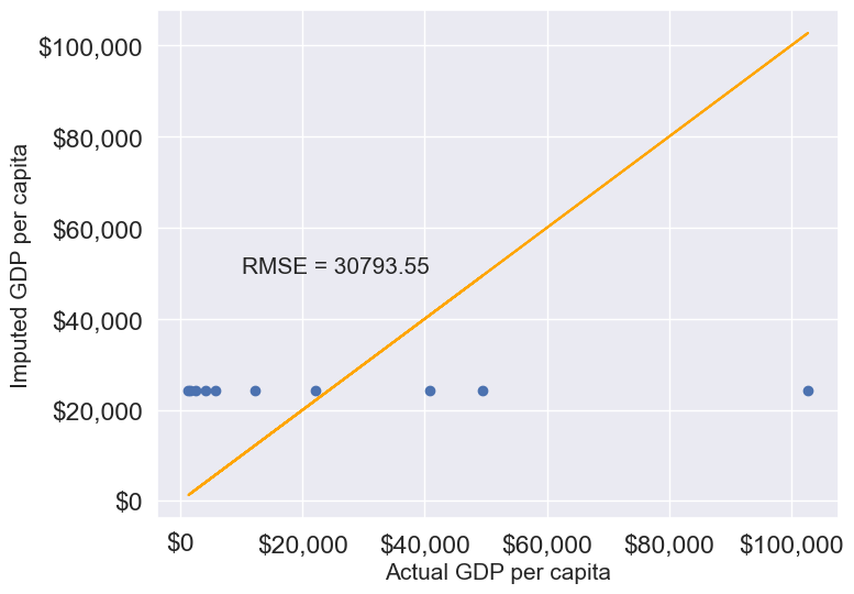
Here, since all columns with missing values are numerical, we could use the mean to impute these values. Using the mean is generally suitable only for numerical data, as it represents a central tendency specific to numbers. For categorical data, however, mean imputation would be inappropriate. Instead, the mode, which identifies the most frequently occurring value, is a more suitable choice for imputing missing values in categorical columns.
11.1.3.2.2 Conditional Imputation: Use other related variables to predict missing values
There are three approaches within this category; please see the details below.
- Imputing missing values based on correlated variables in the data
If a variable is highly correlated with another variable in the dataset, we can approximate its missing values using the trendline with the highly correlated variable.
Let us visualize the distribution of GDP per capita for different continents.
plt.rcParams["figure.figsize"] = (12,6)
sns.boxplot(x = 'continent',y='gdpPerCapita',data = gdp_missing_values_data);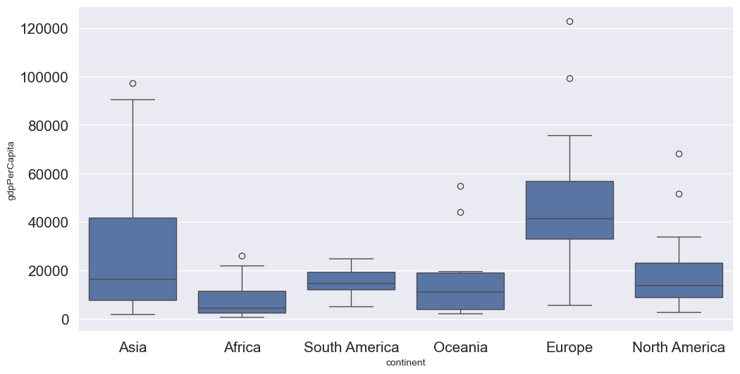
We observe that there is a distinct difference between the GDPs per capita of some of the contents. Let us impute the missing GDP per capita of a country as the mean GDP per capita of the corresponding continent. This imputation should be better than imputing the missing GDP per capita as the mean of all the non-missing values, as the GDP per capita of a country is likely to be closer to the mean GDP per capita of the continent, rather the mean GDP per capita of the whole world.
#Finding the mean GDP per capita of the continent - please defer the understanding of this code to chapter 9.
avg_gdpPerCapita = gdp_missing_values_data['gdpPerCapita'].groupby(gdp_missing_values_data['continent']).mean()
avg_gdpPerCapita
continent
Africa 7638.178571
Asia 25922.750000
Europe 45455.303030
North America 19625.210526
Oceania 15385.857143
South America 15360.909091
Name: gdpPerCapita, dtype: float64#Creating a copy of missing data to impute missing values
gdp_imputed_data_group_mean = gdp_missing_values_data.copy()#Replacing missing GDP per capita with the mean GDP per capita for the corresponding continent
gdp_imputed_data_group_mean.gdpPerCapita = \
gdp_imputed_data_group_mean['gdpPerCapita'].fillna(gdp_imputed_data_group_mean['continent'].map(avg_gdpPerCapita))
plot_actual_vs_predicted(gdp_imputed_data_group_mean)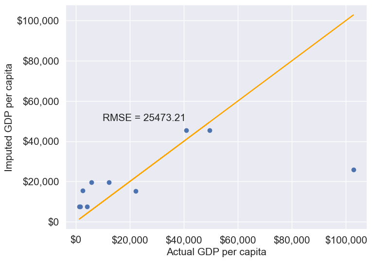
Note that the imputed values are closer to the actual values, and the RMSE has further reduced as expected.
Suppose we wish to impute the missing values of each numeric column with the average of the non-missing values of the respective column corresponding to the continent of the observation. The above logic can be extended to each column as shown in the code below.
all_columns_imputed_data = gdp_missing_values_data.iloc[:,[0,2,3,4,5,6,7,8]].apply(lambda x:\
x.fillna(gdp_imputed_data_group_mean['continent'].map(x.groupby(gdp_missing_values_data['continent']).mean())))
Using Regression
#Let us identify the variable highly correlated with GDP per capita.
gdp_missing_values_data.select_dtypes(include='number').corrwith(gdp_missing_values_data.gdpPerCapita)
economicActivityFemale 0.078332
lifeMale 0.579850
infantMortality -0.572201
gdpPerCapita 1.000000
economicActivityMale -0.134108
illiteracyMale -0.479143
illiteracyFemale -0.448273
lifeFemale 0.615954
dtype: float64#The variable *lifeFemale* has the strongest correlation with GDP per capita. Let us use it to impute missing values of GDP per capita.
# Extract the variables lifeFemale and GDP per capita
x = gdp_missing_values_data.lifeFemale
y = gdp_missing_values_data.gdpPerCapita
# Identify non-missing indices
idx_non_missing = np.isfinite(x) & np.isfinite(y)
# Fit a linear regression model (degree=1) to predict GDP per capita given lifeFemale
slope_intercept_trendline = np.polyfit(x[idx_non_missing],y[idx_non_missing],1) #Finding the slope and intercept for the trendline
compute_y_given_x = np.poly1d(slope_intercept_trendline)
#Creating a copy of missing data to impute missing values
gdp_imputed_data_lr = gdp_missing_values_data.copy()
#Imputing missing values of GDP per capita using the linear regression model
gdp_imputed_data_lr.loc[null_ind_gdpPC,'gdpPerCapita']=compute_y_given_x(gdp_missing_values_data.loc[null_ind_gdpPC,'lifeFemale'])plot_actual_vs_predicted(gdp_imputed_data_lr)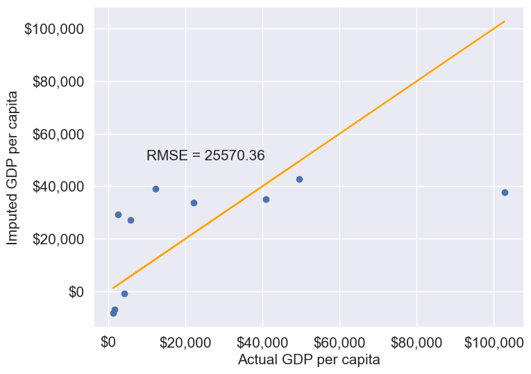
KNN: K-nearest neighbor
In this method, we’ll impute the missing value of the variable as the mean value of the \(K\)-nearest neighbors having non-missing values for that variable. The neighbors to a data-point are identified based on their Euclidean distance to the point in terms of the standardized values of rest of the variables in the data.
Let’s consider a toy example to understand missing value imputation by KNN. Suppose we have to impute missing values in a toy dataset, named as toy_data having 4 observations and 3 variables.
#Toy example - A 4x3 array with missing values
nan = np.nan
toy_data = np.array([[1, 2, nan], [3, 4, 3], [nan, 6, 5], [8, 8, 7]])
toy_data
array([[ 1., 2., nan],
[ 3., 4., 3.],
[nan, 6., 5.],
[ 8., 8., 7.]])We’ll use some functions from the sklearn library to perform the KNN imputation. It is much easier to directly use the algorithm from sklearn, instead of coding it from scratch.
#Library to compute pair-wise Euclidean distance between all observations in the data
from sklearn import metrics

#Library to impute missing values with the KNN algorithm
from sklearn import impute
We’ll use the sklearn function nan_euclidean_distances() to compute the Euclidean distance between all pairs of observations in the data.
#This is the distance matrix containing the distance of the ith observation from the jth observation at the (i,j) position in the matrix
metrics.pairwise.nan_euclidean_distances(toy_data,toy_data)
array([[ 0. , 3.46410162, 6.92820323, 11.29158979],
[ 3.46410162, 0. , 3.46410162, 7.54983444],
[ 6.92820323, 3.46410162, 0. , 3.46410162],
[11.29158979, 7.54983444, 3.46410162, 0. ]])Note that the size of the above matrix is 4x4. This is because the \((i,j)^{th}\) element of the matrix is the distance of the \(i^{th}\) observation from the \(j^{th}\) observation. The matrix is symmetric because the distance of \(i^{th}\) observation to the \(j^{th}\) observation is the same as the distance of the \(j^{th}\) observation to the \(i^{th}\) observation.
We’ll use the sklearn function KNNImputer() to impute the missing value of a column in toy_data as the mean of the values of the \(K\) nearest neighbors to the observation that have non-missing values for that column.
Let us impute the missing values in toy_data using the values of \(K=2\) nearest neighbors from the corresponding observation.
#imputing missing values with 2 nearest neighbors, where the neighbors have equal weights

#Define an object of type KNNImputer
imputer = impute.KNNImputer(n_neighbors=2)

#Use the object method 'fit_transform' to impute missing values
imputer.fit_transform(toy_data)
array([[1. , 2. , 4. ],
[3. , 4. , 3. ],
[5.5, 6. , 5. ],
[8. , 8. , 7. ]])The third observation was the closest to the \(2nd\) and \(4th\) observations based on the Euclidean distance matrix. Thus, the missing value in the \(3rd\) row of the toy_data has been imputed as the mean of the values in the \(2nd\) and \(4th\) observations for the corresponding column. Similarly, the \(1st\) observation is the closest to the \(2nd\) and \(3rd\) observations. Thus the missing value in the \(1st\) row of toy_data has been imputed as the mean of the values in the \(1st\) and \(2nd\) observations for the corresponding column.
Let us use KNN to impute the missing values of gdpPerCapita in gdp_missing_values_data. We’ll use only the numeric columns of the data in imputing the missing values. Also, we’ll ignore contraception as it has a lot of missing values, and thus may not be useful.
#Considering numeric columns in the data to use KNN
num_cols = list(range(0,1))+list(range(2,9))
num_cols
[0, 2, 3, 4, 5, 6, 7, 8]Before computing the pair-wise Euclidean distance of observations, we must standardize the data so that all columns are at the same scale. This will avoid columns with a higher magnitude of values having a higher weight in determining the Euclidean distance. Unless there is a reason to give a higher weight to a column, we assume all columns to have the same weight in the Euclidean distance computation.
We can use the code below to scale the data. However, after imputing the missing values, the data is to be scaled back to the original scale, so that each variable is in the same units as in the original dataset. However, if the code below is used, we’ll lose the orginal scale of each of the columns.
#Scaling data to compute equally weighted distances from the 'k' nearest neighbors
scaled_data = gdp_missing_values_data.iloc[:,num_cols].apply(lambda x:(x-x.min())/(x.max()-x.min()))
To alleviate the problem of losing the orignial scale of the data, we’ll use the MinMaxScaler object of the sklearn library. The object will store the original scale of the data, which will help transform the data back to the original scale once the missing values have been imputed in the standardized data.
# Scaling data - using sklearn

#Create an object of type MinMaxScaler
scaler = sk.preprocessing.MinMaxScaler()

#Use the object method 'fit_transform' to scale the values to a standard uniform distribution
scaled_data = pd.DataFrame(scaler.fit_transform(gdp_missing_values_data.iloc[:,num_cols]))
#Imputing missing values with KNNImputer
#Define an object of type KNNImputer
imputer = impute.KNNImputer(n_neighbors=3, weights="uniform")
#Use the object method 'fit_transform' to impute missing values
imputed_arr = imputer.fit_transform(scaled_data)#Scaling back the scaled array to obtain the data at the original scale
#Use the object method 'inverse_transform' to scale back the values to the original scale of the data
unscaled_data = scaler.inverse_transform(imputed_arr)#Note the method imputes the missing value of all the columns
#However, we are interested in imputing the missing values of only the 'gdpPerCapita' column
gdp_imputed_data_knn = gdp_missing_values_data.copy()
gdp_imputed_data_knn.loc[:,'gdpPerCapita'] = unscaled_data[:,3]#Visualizing the accuracy of missing value imputation with KNN
plot_actual_vs_predicted(gdp_imputed_data_knn)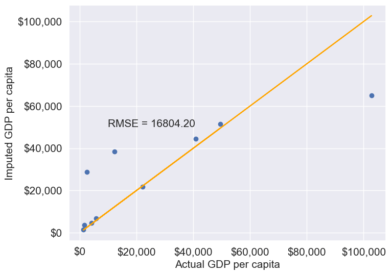
Note that the RMSE is the lowest in this method. It is because this method imputes missing values as the average of the values of “similar” observations, which is smarter and more robust than the previous methods.
We chose \(K=3\) in the missing value imputation for GDP per capita. However, the value of \(K\) is typically chosen using a method known as cross validation. We’ll learn about cross-validation in the next course of the sequence.
11.1.3.2.3 Forward Fill/Backward Fill
To fill missing values in a column by copying the value of the previous or next non-missing observation, we can use forward fill (propagating the last valid observation forward) or backward fill (propagating the next valid observation backward).
Below, we demonstrate forward fill. To perform backward fill instead, simply replace ffill with bfill
#Filling missing values: Method 1- Naive way
gdp_imputed_data_ffill = gdp_missing_values_data.ffill()
Let us next check how good is this method in imputing missing values.
plot_actual_vs_predicted(gdp_imputed_data_ffill)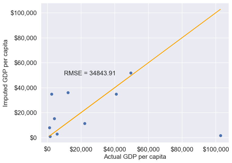
We observe that the accuracy of imputation is poor as GDP per capita can vary a lot across countries, and the data is not sorted by GDP per capita. There is no reason why the GDP per capita of a country should be close to the GDP per capita of the country in the observation above it.
#Checking if any missing values are remaining
gdp_imputed_data_ffill.isnull().sum()
economicActivityFemale 0
country 0
lifeMale 0
infantMortality 0
gdpPerCapita 0
economicActivityMale 0
illiteracyMale 1
illiteracyFemale 0
lifeFemale 0
geographic_location 0
continent 0
dtype: int64After imputing missing values, note there is still one missing value for illiteracyMale. Can you guess why one missing value remained?
11.2 Outlier detection and handling
An outlier is an observation that is significantly different from the rest of the data. Outlier detection and handling are important in data science because outliers can significantly impact the quality, accuracy, and interpretability of data analysis and model performance. Here are the main reasons why it’s crucial to address outliers:
- Preventing Skewed Results: Outliers can distort statistical measures, such as the mean and standard deviation, leading to misleading interpretations of the data. For example, a few extreme values can inflate the mean, making the data seem larger than it is in reality.
- Improving Model Accuracy: Many machine learning algorithms are sensitive to outliers and can perform poorly if outliers are present. For instance, in linear regression, outliers can disproportionately affect the model by pulling the line of best fit toward them, reducing predictive accuracy.
- Enhancing Robustness of Models: Identifying and handling outliers can make models more robust and stable. By minimizing the influence of extreme values, models become less sensitive to noise, which improves generalization and reduces overfitting.
11.2.1 Outlier detection
Outlier detection is crucial for identifying unusual values in your data that may need to be investigated, removed, or transformed. Here are several popular methods for detecting outliers:
We will use College.csv that contains information about US universities as our dataset in this section. The description of variables of the dataset can be found on page 65 of this book.
# Load the College dataset
college = pd.read_csv('./Datasets/College.csv')
college.head()| Unnamed: 0 | Private | Apps | Accept | Enroll | Top10perc | Top25perc | F.Undergrad | P.Undergrad | Outstate | Room.Board | Books | Personal | PhD | Terminal | S.F.Ratio | perc.alumni | Expend | Grad.Rate | |
|---|---|---|---|---|---|---|---|---|---|---|---|---|---|---|---|---|---|---|---|
| 0 | Abilene Christian University | Yes | 1660 | 1232 | 721 | 23 | 52 | 2885 | 537 | 7440 | 3300 | 450 | 2200 | 70 | 78 | 18.1 | 12 | 7041 | 60 |
| 1 | Adelphi University | Yes | 2186 | 1924 | 512 | 16 | 29 | 2683 | 1227 | 12280 | 6450 | 750 | 1500 | 29 | 30 | 12.2 | 16 | 10527 | 56 |
| 2 | Adrian College | Yes | 1428 | 1097 | 336 | 22 | 50 | 1036 | 99 | 11250 | 3750 | 400 | 1165 | 53 | 66 | 12.9 | 30 | 8735 | 54 |
| 3 | Agnes Scott College | Yes | 417 | 349 | 137 | 60 | 89 | 510 | 63 | 12960 | 5450 | 450 | 875 | 92 | 97 | 7.7 | 37 | 19016 | 59 |
| 4 | Alaska Pacific University | Yes | 193 | 146 | 55 | 16 | 44 | 249 | 869 | 7560 | 4120 | 800 | 1500 | 76 | 72 | 11.9 | 2 | 10922 | 15 |
11.2.1.1 Visualization Methods
- Box Plot: A box plot is a quick and visual way to detect outliers, where points outside the “whiskers” are considered outliers.
Let us visualize outliers in average instructional expenditure per student given by the variable Expend.
ax=college.boxplot(column = 'Expend')
ax.yaxis.set_major_formatter('${x:,.0f}')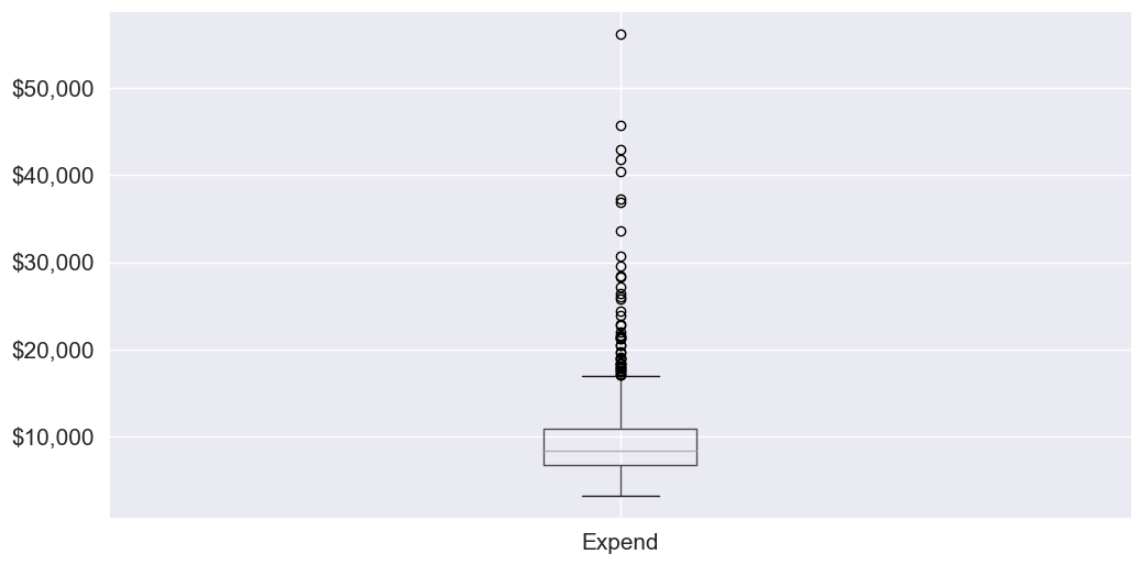
There are several outliers (shown as circles in the above boxplot), which correspond to high values of average instructional expenditure per student.
- Histogram: Histograms can reveal unusual values as isolated bars, helping to identify outliers in a single feature.
# create a histogram of expend
college['Expend'].plot(kind='hist', edgecolor='black', bins=20)
plt.xlabel('Expenditure')
plt.ylabel('Frequency')
plt.title('Histogram of Expenditure')
plt.show()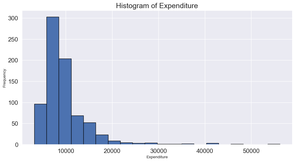
- Scatter Plot: A scatter plot can reveal outliers, especially in two-dimensional data. Outliers will often appear as points separated from the main cluster.
Let’s make a scatterplot of ‘Grad.Rate’ vs ‘Expend’ with a trendline, to visualize potential outliers
sns.set(font_scale=1.5)
ax=sns.regplot(data = college, x = "Expend", y = "Grad.Rate",scatter_kws={"color": "orange"}, line_kws={"color": "blue"})
ax.xaxis.set_major_formatter('${x:,.0f}')
ax.set_xlabel('Expenditure per student')
ax.set_ylabel('Graduation rate')
plt.show()
The trendline indicates a positive correlation between Expend and Grad.Rate. However, there seems to be a lot of noise and presence of outliers in the data.
11.2.1.2 Statistical Methods
Visualization helps us identify potential outliers. To address them effectively, we need to extract these outlier instances using a defined threshold. Two commonly used statistical methods for this purpose are the Z-Score method and the Interquartile Range (IQR) (Tukey’s fences).
11.2.1.2.1 Z-Score (Standard Score)
Calculates how many standard deviations a data point is from the mean. Commonly, data points with a Z-score greater than 3 (or less than -3) are considered outliers.
from scipy import stats

# Calculate Z-scores and identify outliers
college['z_score'] = stats.zscore(college['Expend'])
college['is_z_score_outlier'] = college['z_score'].abs() > 3

# Filter to show only the outliers
z_score_outliers = college[college['is_z_score_outlier']]
print(z_score_outliers.shape)
z_score_outliers.head()
(16, 21)| Unnamed: 0 | Private | Apps | Accept | Enroll | Top10perc | Top25perc | F.Undergrad | P.Undergrad | Outstate | ... | Books | Personal | PhD | Terminal | S.F.Ratio | perc.alumni | Expend | Grad.Rate | z_score | is_z_score_outlier | |
|---|---|---|---|---|---|---|---|---|---|---|---|---|---|---|---|---|---|---|---|---|---|
| 20 | Antioch University | Yes | 713 | 661 | 252 | 25 | 44 | 712 | 23 | 15476 | ... | 400 | 1100 | 69 | 82 | 11.3 | 35 | 42926 | 48 | 6.374709 | True |
| 144 | Columbia University | Yes | 6756 | 1930 | 871 | 78 | 96 | 3376 | 55 | 18624 | ... | 550 | 300 | 97 | 98 | 5.9 | 21 | 30639 | 99 | 4.020159 | True |
| 158 | Dartmouth College | Yes | 8587 | 2273 | 1087 | 87 | 99 | 3918 | 32 | 19545 | ... | 550 | 1100 | 95 | 99 | 4.7 | 49 | 29619 | 98 | 3.824698 | True |
| 174 | Duke University | Yes | 13789 | 3893 | 1583 | 90 | 98 | 6188 | 53 | 18590 | ... | 625 | 1162 | 95 | 96 | 5.0 | 44 | 27206 | 97 | 3.362296 | True |
| 191 | Emory University | Yes | 8506 | 4168 | 1236 | 76 | 97 | 5544 | 192 | 17600 | ... | 600 | 870 | 97 | 98 | 5.0 | 28 | 28457 | 96 | 3.602024 | True |
5 rows × 21 columns
Boxplot identifies outliers based on the Tukey’s fences criterion:
11.2.1.2.2 IQR method (Tukey’s fences)
John Tukey proposed that observations outside the range \([Q1 - 1.5(Q3-Q1), Q3+1.5(Q3-Q1)]\) are outliers, where \(Q1\) and \(Q3\) are the lower \((25\%)\) and upper \((75\%)\) quartiles respectively. Let us detect outliers based on this threshold.
# Calculate the first and third quartiles, and the IQR
Q1 = np.percentile(college['Expend'], 25)
Q3 = np.percentile(college['Expend'], 75)
IQR = Q3 - Q1

# Define the lower and upper bounds for outliers
lower_bound = Q1 - 1.5 * IQR
upper_bound = Q3 + 1.5 * IQR

# Add a new column to indicate IQR outliers
college['is_IQR_outlier'] = (college['Expend'] < lower_bound) | (college['Expend'] > upper_bound)

# Filter to show only the IQR outliers
iqr_outliers = college[college['is_IQR_outlier']]
print(iqr_outliers.shape)
iqr_outliers.head()
(48, 22)| Unnamed: 0 | Private | Apps | Accept | Enroll | Top10perc | Top25perc | F.Undergrad | P.Undergrad | Outstate | ... | Personal | PhD | Terminal | S.F.Ratio | perc.alumni | Expend | Grad.Rate | z_score | is_z_score_outlier | is_IQR_outlier | |
|---|---|---|---|---|---|---|---|---|---|---|---|---|---|---|---|---|---|---|---|---|---|
| 3 | Agnes Scott College | Yes | 417 | 349 | 137 | 60 | 89 | 510 | 63 | 12960 | ... | 875 | 92 | 97 | 7.7 | 37 | 19016 | 59 | 1.792851 | False | True |
| 16 | Amherst College | Yes | 4302 | 992 | 418 | 83 | 96 | 1593 | 5 | 19760 | ... | 1598 | 93 | 98 | 8.4 | 63 | 21424 | 100 | 2.254295 | False | True |
| 20 | Antioch University | Yes | 713 | 661 | 252 | 25 | 44 | 712 | 23 | 15476 | ... | 1100 | 69 | 82 | 11.3 | 35 | 42926 | 48 | 6.374709 | True | True |
| 60 | Bowdoin College | Yes | 3356 | 1019 | 418 | 76 | 100 | 1490 | 8 | 19030 | ... | 875 | 93 | 96 | 11.2 | 52 | 20447 | 96 | 2.067073 | False | True |
| 64 | Brandeis University | Yes | 4186 | 2743 | 740 | 48 | 77 | 2819 | 62 | 19380 | ... | 1000 | 90 | 97 | 9.8 | 24 | 17150 | 84 | 1.435271 | False | True |
5 rows × 22 columns
Using the IQR method, more instances in the college dataset are marked as outliers.
11.2.1.2.3 When to use each:
Use IQR when:
- Data is skewed
- You don’t want to assume any distribution
- You want a more sensitive detector
Use Z-score when:
- Data is approximately normal
- You want a more conservative approach
- You need a method that’s easily interpretable
The actual number of outliers marked by each method will depend on your specific dataset’s distribution and characteristics.
11.2.2 Common Methods for Handling outliers
Once we identify outlier instances using statistical methods, the next step is to handle them. Below are some commonly used approaches:
- Removing Outliers: Discarding extreme values if they are likely due to errors or are irrelevant for the analysis.
- Winsorizing: Capping/flooring outliers to a specific percentile to reduce their influence without removing them completely.
- Replacing with the median: Replacing outlier values with the median of the remaining data. The median is less affected by extreme values than the mean, making it an ideal choice for imputation when dealing with outliers
- Transforming Data: Applying transformations (e.g., log, square root) to reduce the impact of outliers.
def method_removal():
    """Method 1: Remove outliers"""
    data_cleaned = college[~college['is_outlier']]['Expend']
    return data_cleaned
def method_capping():
"""Method 2: Capping (Winsorization)"""
data_capped = college['Expend'].copy()
data_capped[data_capped < lower_bound] = lower_bound
data_capped[data_capped > upper_bound] = upper_bound
return data_cappeddef method_mean_replacement():
"""Method 3: Replace with median"""
data_median = college['Expend'].copy()
median_value = college[~college['is_outlier']]['Expend'].median()
data_median[college['is_outlier']] = median_value
return data_mediandef method_log_transformation():
"""Method 4: Log transformation"""
data_log = np.log1p(college['Expend'])
return data_logYour Practice: Try each method and compare their results to see how they differ in handling outliers.
In real-world applications, handling outliers should be approached on a case-by-case basis. However, here are some general recommendations:
Recommendations for Different Scenarios:
Data Removal:
- Use when: You have a large dataset and can afford to lose data
- Pros: Simple, removes all outlier influence
- Cons: Loss of data, potential loss of important information
Capping (Winsorization):
- Use when: You want to preserve data count while limiting extreme values
- Pros: Preserves data size, reduces impact of outliers
- Cons: Artificial boundary creation, potential loss of genuine extreme events
Median Replacement:
- Use when: The data is normally distributed, and outliers are verified as errors or anomalies not representing true values
- Pros: Maintains data size, simple to implement
- Cons: Reduces variance, may not represent the true distribution
Log Transformation:
- Use when: Data has a right-skewed distribution, and you want to reduce the impact of large outliers.
- Pros: Reduces skewness, minimizes the effect of extreme values, can make data more normal-like.
- Cons: Only applicable to positive values, may not be effective for extremely high outliers.
11.3 Data binning
Data binning is a powerful technique in data analysis where continuous numerical data is grouped into discrete intervals or “bins.” Imagine it as sorting items into distinct categories or “buckets” based on their values, making it easier to observe trends, patterns, and groupings within large datasets. We encounter binning in everyday life without even realizing it.
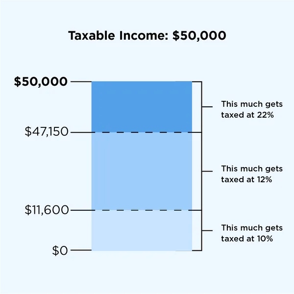
For example, consider age groups: instead of listing every individual age, we often refer to broader categories like “under 20,” “20-30,” “30-40,” or “40 and over.” This binning approach helps simplify data interpretation and comparison across different age groups. Another common example is tax brackets. Tax rates are often applied to ranges of income, like “up to $11,000,” “$11,001 to $44,725,” and so forth. Here, income values are grouped into bins to determine applicable tax rates, making complex tax data easier to manage and understand.
11.3.1 Key reasons for binning:
- Better intepretation of data
- Making better recommendations
- Smooth data, reduce noise
Examples:
Binning to better interpret data
- The number of flu cases everyday may be binned to seasons such as fall, spring, winter and summer, to understand the effect of season on flu.
Binning to make recommendations:
A doctor may like to group patient age into bins. Grouping patient ages into categories such as Age <=12, 12<Age<=18, 18<Age<=65, Age>65 may help recommend the kind/doses of covid vaccine a patient needs.
A credit card company may want to bin customers based on their spend, as “High spenders”, “Medium spenders” and “Low spenders”. Binning will help them design customized marketing campaigns for each bin, thereby increasing customer response (or revenue). On the other hand, they use the same campaign for customers withing the same bin, thus minimizng marketing costs.
Binning to smooth data, and reduce noise
- A sales company may want to bin their total sales to a weekly / monthly / yearly level to reduce the noise in day-to-day sales.
Using our college dataset, let’s apply binning to better interpret the relationship between instructional expenditure per student (Expend) and graduation rate (Grad.Rate) for U.S. universities, and make relevant recommendations
Here is the previous scatterplot of ‘Grad.Rate’ vs ‘Expend’ with a trendline.
# scatter plot of Expend vs Grad.Rate
ax=sns.regplot(data = college, x = "Expend", y = "Grad.Rate",scatter_kws={"color": "orange"}, line_kws={"color": "blue"})
ax.xaxis.set_major_formatter('${x:,.0f}')
ax.set_xlabel('Expenditure per student')
ax.set_ylabel('Graduation rate')
plt.show()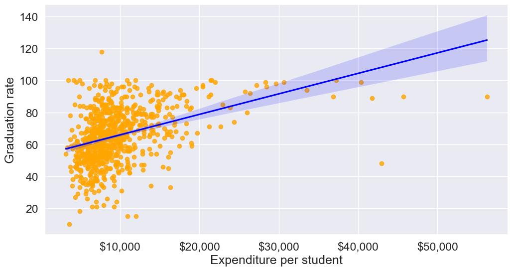
The trendline indicates a positive correlation between Expend and Grad.Rate. However, there seems to be a lot of noise and presence of outliers in the data, which makes it hard to interpret the overall trend.
11.3.2 Common binning methods:
- Equal-width: Divides range into equal-sized intervals
- Equal-size: Places equal number of observations in each bin
- Custom: Based on domain knowledge (like age groups above)
We’ll bin Expend to see if we can better analyze its association with Grad.Rate. However, let us first visualize the distribution of Expend.
#Visualizing the distribution of expend
ax=sns.histplot(data = college, x= 'Expend')
ax.xaxis.set_major_formatter('${x:,.0f}')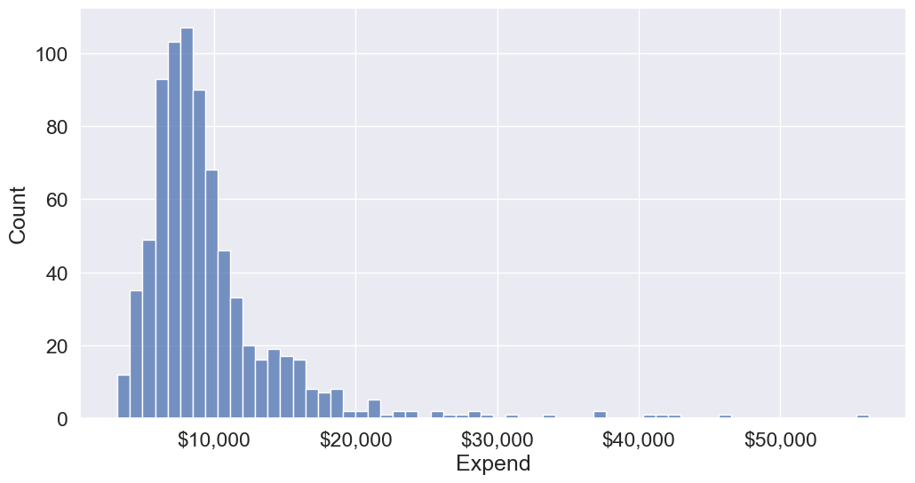
The distribution of Extend is right skewed with potentially some extremely high outlying values.
11.3.2.1 Binning with equal width bins
We’ll use the Pandas function cut() to bin Expend. This function creates bins such that all bins have the same width.
#Using the cut() function in Pandas to bin "Expend"
Binned_expend = pd.cut(college['Expend'],3,retbins = True)
Binned_expend
(0 (3132.953, 20868.333]
1 (3132.953, 20868.333]
2 (3132.953, 20868.333]
3 (3132.953, 20868.333]
4 (3132.953, 20868.333]
...
772 (3132.953, 20868.333]
773 (3132.953, 20868.333]
774 (3132.953, 20868.333]
775 (38550.667, 56233.0]
776 (3132.953, 20868.333]
Name: Expend, Length: 777, dtype: category
Categories (3, interval[float64, right]): [(3132.953, 20868.333] < (20868.333, 38550.667] < (38550.667, 56233.0]],
array([ 3132.953 , 20868.33333333, 38550.66666667, 56233. ]))The cut() function returns a tuple of length 2. The first element of the tuple are the bins, while the second element is an array containing the cut-off values for the bins.
type(Binned_expend)tuplelen(Binned_expend)2Once the bins are obtained, we’ll add a column in the dataset that indicates the bin for Expend.
#Creating a categorical variable to store the level of expenditure on a student
college['Expend_bin'] = Binned_expend[0]
college.head()| Unnamed: 0 | Private | Apps | Accept | Enroll | Top10perc | Top25perc | F.Undergrad | P.Undergrad | Outstate | ... | PhD | Terminal | S.F.Ratio | perc.alumni | Expend | Grad.Rate | z_score | is_z_score_outlier | is_IQR_outlier | Expend_bin | |
|---|---|---|---|---|---|---|---|---|---|---|---|---|---|---|---|---|---|---|---|---|---|
| 0 | Abilene Christian University | Yes | 1660 | 1232 | 721 | 23 | 52 | 2885 | 537 | 7440 | ... | 70 | 78 | 18.1 | 12 | 7041 | 60 | -0.501910 | False | False | (3132.953, 20868.333] |
| 1 | Adelphi University | Yes | 2186 | 1924 | 512 | 16 | 29 | 2683 | 1227 | 12280 | ... | 29 | 30 | 12.2 | 16 | 10527 | 56 | 0.166110 | False | False | (3132.953, 20868.333] |
| 2 | Adrian College | Yes | 1428 | 1097 | 336 | 22 | 50 | 1036 | 99 | 11250 | ... | 53 | 66 | 12.9 | 30 | 8735 | 54 | -0.177290 | False | False | (3132.953, 20868.333] |
| 3 | Agnes Scott College | Yes | 417 | 349 | 137 | 60 | 89 | 510 | 63 | 12960 | ... | 92 | 97 | 7.7 | 37 | 19016 | 59 | 1.792851 | False | True | (3132.953, 20868.333] |
| 4 | Alaska Pacific University | Yes | 193 | 146 | 55 | 16 | 44 | 249 | 869 | 7560 | ... | 76 | 72 | 11.9 | 2 | 10922 | 15 | 0.241803 | False | False | (3132.953, 20868.333] |
5 rows × 23 columns
See the variable Expend_bin in the above dataset.
Let us visualize the Expend bins over the distribution of the Expend variable.
#Visualizing the bins for instructional expediture on a student
sns.set(font_scale=1.25)
plt.rcParams["figure.figsize"] = (9,6)
ax=sns.histplot(data = college, x= 'Expend')
plt.vlines(Binned_expend[1], 0,100,color='red')
plt.xlabel('Expenditure per student');
plt.ylabel('Graduation rate');
ax.xaxis.set_major_formatter('${x:,.0f}')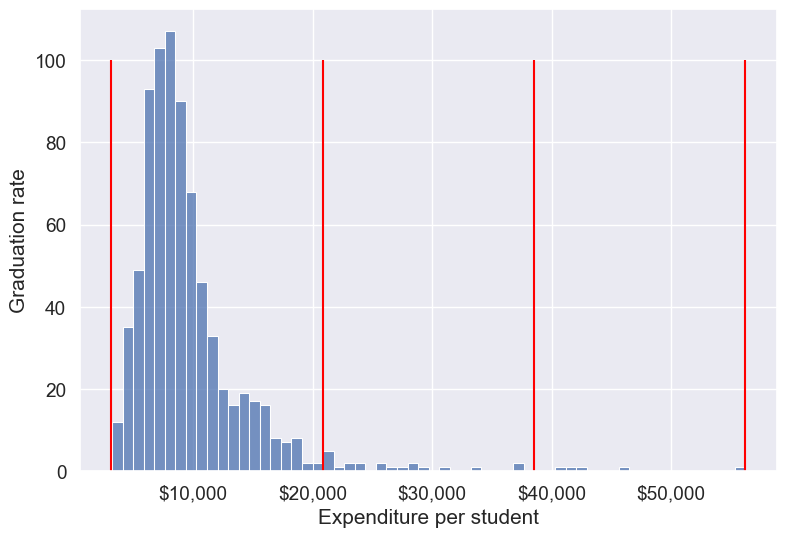
By default, the bins created have equal width. They are created by dividing the range between the maximum and minimum value of Expend into the desired number of equal-width intervals. We can label the bins as well as follows.
college['Expend_bin'] = pd.cut(college['Expend'],3,labels = ['Low expend','Med expend','High expend'])
college['Expend_bin']
0 Low expend
1 Low expend
2 Low expend
3 Low expend
4 Low expend
...
772 Low expend
773 Low expend
774 Low expend
775 High expend
776 Low expend
Name: Expend_bin, Length: 777, dtype: category
Categories (3, object): ['Low expend' < 'Med expend' < 'High expend']Now that we have binned the variable Expend, let us see if we can better visualize the association of graduation rate with expenditure per student using Expened_bin.
#Visualizing average graduation rate vs categories of instructional expenditure per student
sns.barplot(x = 'Expend_bin', y = 'Grad.Rate', data = college)
<Axes: xlabel='Expend_bin', ylabel='Grad.Rate'>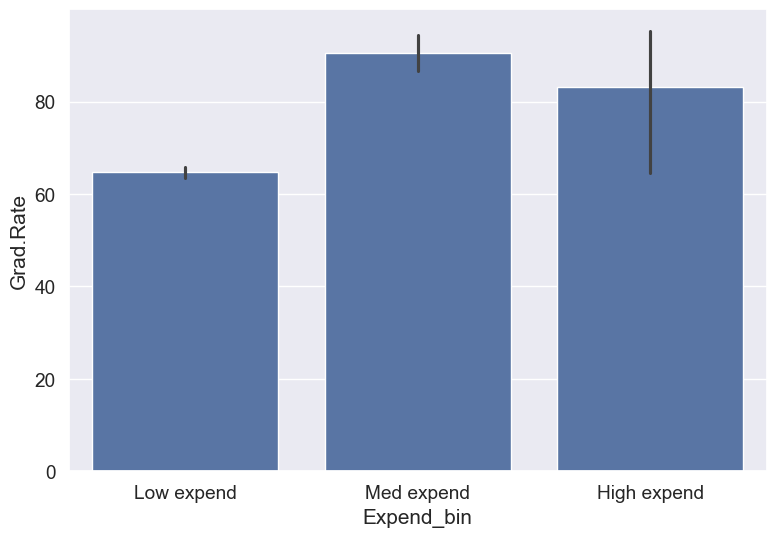
It seems that the graduation rate is the highest for universities with medium level of expenditure per student. This is different from the trend we saw earlier in the scatter plot. Let us investigate.
Let us find the number of universities in each bin.
college['Expend_bin'].value_counts()Expend_bin
Low expend 751
Med expend 21
High expend 5
Name: count, dtype: int64The bin High expend consists of only 5 universities, or 0.6% of all the universities in the dataset. These universities may be outliers that are skewing the trend (as also evident in the histogram above).
Let us see if we get the correct trend with the outliers removed from the data.
#Data without outliers
college_data_without_outliers = college[((college.Expend>=lower_bound) & (college.Expend<=upper_bound))]
Binned_data = pd.cut(college_data_without_outliers['Expend'],3,labels = ['Low expend','Med expend','High expend'],retbins = True)
college_data_without_outliers.loc[:,'Expend_bin'] = Binned_data[0]sns.barplot(x = 'Expend_bin', y = 'Grad.Rate', data = college_data_without_outliers)<Axes: xlabel='Expend_bin', ylabel='Grad.Rate'>
With the outliers removed, we obtain the correct overall trend, even in the case of equal-width bins. Note that these bins have unequal number of observations as shown below.
ax=sns.histplot(data = college_data_without_outliers, x= 'Expend')
for i in range(4):
    plt.axvline(Binned_data[1][i], 0,100,color='red')
plt.xlabel('Expenditure per student');
plt.ylabel('Graduation rate');
ax.xaxis.set_major_formatter('${x:,.0f}')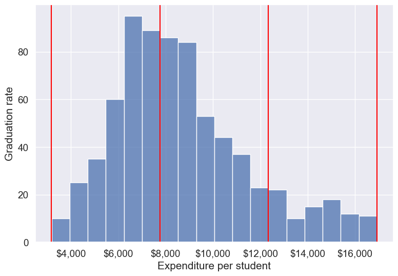
Note that the right tail of the histogram has disappered since we removed outliers.
college_data_without_outliers['Expend_bin'].value_counts()Expend_bin
Med expend 327
Low expend 314
High expend 88
Name: count, dtype: int64Instead of removing outliers, we can address the issue by binning observations into equal-sized bins, ensuring each bin has the same number of observations. Let’s explore this approach next.
11.3.2.2 Binning with equal sized bins
Let us bin the variable Expend such that each bin consists of the same number of observations.
We’ll use the Pandas function qcut() to make equal-sized bins (in contrast to equal-width bins in the previous section).
#Using the Pandas function qcut() to create bins with the same number of observations
Binned_expend = pd.qcut(college['Expend'],3,retbins = True)
college['Expend_bin'] = Binned_expend[0]
Each bin has the same number of observations with qcut():
college['Expend_bin'].value_counts()Expend_bin
(3185.999, 7334.333] 259
(7334.333, 9682.333] 259
(9682.333, 56233.0] 259
Name: count, dtype: int64Let us visualize the Expend bins over the distribution of the Expend variable.
#Visualizing the bins for instructional expediture on a student
sns.set(font_scale=1.25)
plt.rcParams["figure.figsize"] = (9,6)
ax=sns.histplot(data = college, x= 'Expend')
plt.vlines(Binned_expend[1], 0,100,color='red')
plt.xlabel('Expenditure per student');
plt.ylabel('Graduation rate');
ax.xaxis.set_major_formatter('${x:,.0f}')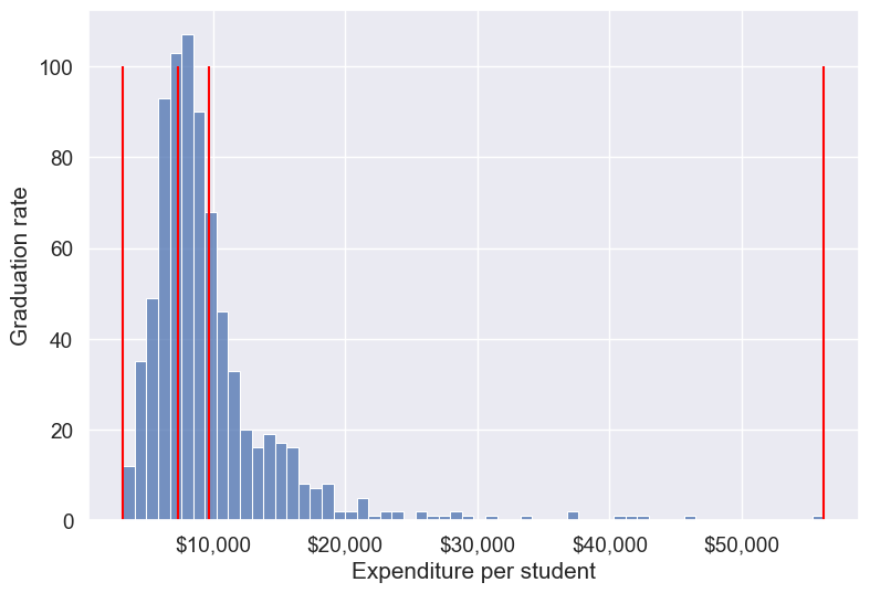
Note that the bin-widths have been adjusted to have the same number of observations in each bin. The bins are narrower in domains of high density, and wider in domains of sparse density.
Let us again make the barplot visualizing the average graduate rate with level of instructional expenditure per student.
college['Expend_bin'] = pd.qcut(college['Expend'],3,labels = ['Low expend','Med expend','High expend'])
a=sns.barplot(x = 'Expend_bin', y = 'Grad.Rate', data = college)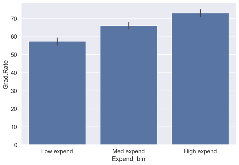
Now we see the same trend that we saw in the scatterplot, but without the noise. We have smoothed the data. Note that making equal-sized bins helps reduce the effect of outliers in the overall trend.
Suppose this analysis was done to provide recommendations to universities for increasing their graduation rate. With binning, we can can provide one recommendation to ‘Low expend’ universities, and another one to ‘Med expend’ universities. For example, the recommendations can be:
- ‘Low expend’ universities can expect an increase of 9 percentage points in
Grad.Rate, if they migrate to the ‘Med expend’ category. - ‘Med expend’ universities can expect an increase of 7 percentage points in
Grad.Rate, if they migrate to the ‘High expend’ category.
The numbers in the above recommendations are based on the table below.
college.groupby(college.Expend_bin, observed=False)['Grad.Rate'].mean()Expend_bin
Low expend 57.343629
Med expend 66.057915
High expend 72.988417
Name: Grad.Rate, dtype: float64We can also provide recommendations based on the confidence intervals of the mean graduation rate (Grad.Rate). The confidence intervals, calculated below, are derived using a method known as bootstrapping. For a detailed explanation of bootstrapping, please refer to this article on Wikipedia.
# Bootstrapping to find 95% confidence intervals of Graduation Rate of US universities based on average expenditure per student
confidence_intervals = {}

# Loop through each expenditure bin
for expend_bin, data_sub in college.groupby('Expend_bin', observed=False):
    # Generate bootstrap samples for the graduation rate
    samples = np.random.choice(data_sub['Grad.Rate'], size=(10000, len(data_sub)), replace=True)

    # Calculate the mean of each sample
    sample_means = samples.mean(axis=1)

    # Calculate the 95% confidence interval
    lower_bound = np.percentile(sample_means, 2.5)
    upper_bound = np.percentile(sample_means, 97.5)

    # Store the result in the dictionary
    confidence_intervals[expend_bin] = (round(lower_bound, 2), round(upper_bound, 2))

# Print the results
for expend_bin, ci in confidence_intervals.items():
    print(f"95% Confidence interval of Grad.Rate for {expend_bin} universities = [{ci[0]}, {ci[1]}]")
95% Confidence interval of Grad.Rate for Low expend universities = [55.36, 59.36]
95% Confidence interval of Grad.Rate for Med expend universities = [64.15, 67.95]
95% Confidence interval of Grad.Rate for High expend universities = [71.03, 74.92]Apart from equal-width and equal-sized bins, custom bins can be created using the bins argument. Suppose, bins are to be created for Expend with cutoffs \(\$10,000, \$20,000, \$30,000... \$60,000\). Then, we can use the bins argument as in the code below:
11.3.2.3 Binning with custom bins
Binned_expend = pd.cut(college.Expend,bins = list(range(0,70000,10000)),retbins=True)#Visualizing the bins for instructional expediture on a student
ax=sns.histplot(data = college, x= 'Expend')
plt.vlines(Binned_expend[1], 0,100,color='red')
plt.xlabel('Expenditure per student');
plt.ylabel('Graduation rate');
ax.xaxis.set_major_formatter('${x:,.0f}')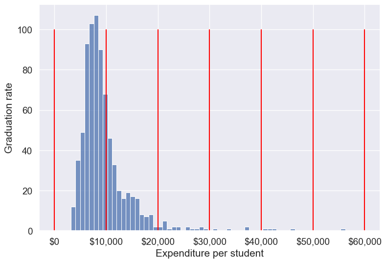
Next, let’s create a custom bin with unequal sizes and widths.
# Create bins and labels
bins = [college['Expend'].min(), 10000, 40000, college['Expend'].max()]
labels = ['Low Expenditure', 'Medium Expenditure', 'High Expenditure']

# Binning the 'Expend' column
college['Expend_Binned'] = pd.cut(college['Expend'], bins=bins, labels=labels)

# Visualizing the bins using a histogram
ax = sns.histplot(data=college, x='Expend', kde=False)

# Add vertical lines for the bin edges (the bin edges are the values in 'bins')
for bin_edge in bins[1:-1]:  # skip the first and last bins since they are the edges
    plt.vlines(bin_edge, 0, ax.get_ylim()[1], color='red')

# Add labels and formatting
plt.xlabel('Expenditure per student')
plt.ylabel('Frequency')
ax.xaxis.set_major_formatter('${x:,.0f}')

# Display the plot
plt.show()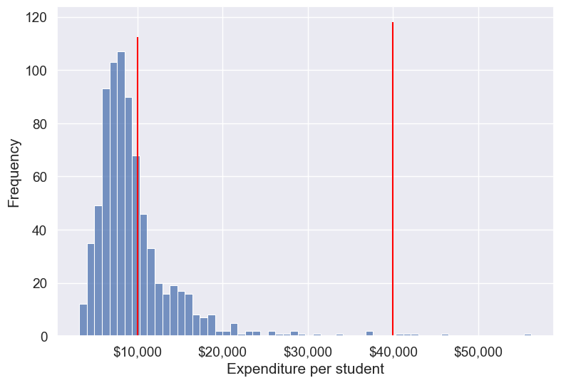
As custom bin-cutoffs can be specified with the cut() function, custom bin quantiles can be specified with the qcut() function.
11.4 Dummy / Indicator variables
Dummy or indicator variables are binary variables created to represent categorical data in numerical form, typically used in regression and machine learning models. Each category is represented by a separate dummy variable with values of 0 or 1.
11.4.1 Purpose:
- Enables categorical data to be used in quantitative analysis: Models like linear regression and many machine learning algorithms require numerical input, making dummy variables essential for handling categorical data.
- Preserves information: Converts categorical information into a format that models can interpret without losing meaning.
11.4.2 When to use dummy variables
Dummy variables are especially useful in:
- Regression models: For categorical predictors, such as region, gender, or type of product.
- Machine learning algorithms: Many models, including tree-based methods, can benefit from dummy variables for categorical features.
11.4.3 How to Create Dummy variables
The pandas library in Python has a built-in function, pd.get_dummies(), to generate dummy variables. If a column in a DataFrame has \(k\) distinct values, we will get a DataFrame with \(k\) columns containing 0s and 1s
Let us make dummy variables with the equal-sized bins we created for the average instruction expenditure per student.
#Using the Pandas function qcut() to create bins with the same number of observations
Binned_expend = pd.qcut(college['Expend'],3,retbins = True,labels = ['Low_expend','Med_expend','High_expend'])
college['Expend_bin'] = Binned_expend[0]
#Making dummy variables based on the levels (categories) of the 'Expend_bin' variable
dummy_Expend = pd.get_dummies(college['Expend_bin'], dtype=int)The dummy data dummy_Expend has a value of \(1\) if the observation corresponds to the category referenced by the column name.
dummy_Expend.head()| Low_expend | Med_expend | High_expend | |
|---|---|---|---|
| 0 | 1 | 0 | 0 |
| 1 | 0 | 0 | 1 |
| 2 | 0 | 1 | 0 |
| 3 | 0 | 0 | 1 |
| 4 | 0 | 0 | 1 |
Adding the dummy columns back to the original dataframe
#Concatenating the dummy variables to the original data
college = pd.concat([college,dummy_Expend],axis=1)
print(college.shape)
college.head()
(777, 26)| Unnamed: 0 | Private | Apps | Accept | Enroll | Top10perc | Top25perc | F.Undergrad | P.Undergrad | Outstate | ... | perc.alumni | Expend | Grad.Rate | z_score | is_z_score_outlier | is_IQR_outlier | Expend_bin | Low_expend | Med_expend | High_expend | |
|---|---|---|---|---|---|---|---|---|---|---|---|---|---|---|---|---|---|---|---|---|---|
| 0 | Abilene Christian University | Yes | 1660 | 1232 | 721 | 23 | 52 | 2885 | 537 | 7440 | ... | 12 | 7041 | 60 | -0.501910 | False | False | Low_expend | 1 | 0 | 0 |
| 1 | Adelphi University | Yes | 2186 | 1924 | 512 | 16 | 29 | 2683 | 1227 | 12280 | ... | 16 | 10527 | 56 | 0.166110 | False | False | High_expend | 0 | 0 | 1 |
| 2 | Adrian College | Yes | 1428 | 1097 | 336 | 22 | 50 | 1036 | 99 | 11250 | ... | 30 | 8735 | 54 | -0.177290 | False | False | Med_expend | 0 | 1 | 0 |
| 3 | Agnes Scott College | Yes | 417 | 349 | 137 | 60 | 89 | 510 | 63 | 12960 | ... | 37 | 19016 | 59 | 1.792851 | False | True | High_expend | 0 | 0 | 1 |
| 4 | Alaska Pacific University | Yes | 193 | 146 | 55 | 16 | 44 | 249 | 869 | 7560 | ... | 2 | 10922 | 15 | 0.241803 | False | False | High_expend | 0 | 0 | 1 |
5 rows × 26 columns
We can find the correlation between the dummy variables and graduation rate to identify if any of the dummy variables will be useful to estimate graduation rate (Grad.Rate).
#Finding if dummy variables will be useful to estimate 'Grad.Rate'
dummy_Expend.corrwith(college['Grad.Rate'])
Low_expend -0.334456
Med_expend 0.024492
High_expend 0.309964
dtype: float64The dummy variables Low expend and High expend may contribute in explaining Grad.Rate in a regression model.
11.4.4 Using drop_first to Avoid Multicollinearity
In cases like linear regression, you may want to drop one dummy variable to avoid multicollinearity (perfect correlation between variables).
# create dummy variables, dropping the first to avoid multicollinearity
dummy_Expend = pd.get_dummies(college['Expend_bin'], dtype=int, drop_first=True)

# add the dummy variables to the original dataset
college = pd.concat([college, dummy_Expend], axis=1)

college.head()| Unnamed: 0 | Private | Apps | Accept | Enroll | Top10perc | Top25perc | F.Undergrad | P.Undergrad | Outstate | ... | Grad.Rate | z_score | is_z_score_outlier | is_IQR_outlier | Expend_bin | Low_expend | Med_expend | High_expend | Med_expend | High_expend | |
|---|---|---|---|---|---|---|---|---|---|---|---|---|---|---|---|---|---|---|---|---|---|
| 0 | Abilene Christian University | Yes | 1660 | 1232 | 721 | 23 | 52 | 2885 | 537 | 7440 | ... | 60 | -0.501910 | False | False | Low_expend | 1 | 0 | 0 | 0 | 0 |
| 1 | Adelphi University | Yes | 2186 | 1924 | 512 | 16 | 29 | 2683 | 1227 | 12280 | ... | 56 | 0.166110 | False | False | High_expend | 0 | 0 | 1 | 0 | 1 |
| 2 | Adrian College | Yes | 1428 | 1097 | 336 | 22 | 50 | 1036 | 99 | 11250 | ... | 54 | -0.177290 | False | False | Med_expend | 0 | 1 | 0 | 1 | 0 |
| 3 | Agnes Scott College | Yes | 417 | 349 | 137 | 60 | 89 | 510 | 63 | 12960 | ... | 59 | 1.792851 | False | True | High_expend | 0 | 0 | 1 | 0 | 1 |
| 4 | Alaska Pacific University | Yes | 193 | 146 | 55 | 16 | 44 | 249 | 869 | 7560 | ... | 15 | 0.241803 | False | False | High_expend | 0 | 0 | 1 | 0 | 1 |
5 rows × 28 columns
11.5 Independent Study
11.5.1 Practice exercise 1
Read survey_data_clean.csv. Split the columns of the dataset, such that all columns with categorical values transform into dummy variables with each category corresponding to a column of 0s and 1s. Leave the Timestamp column.
As all categorical columns are transformed to dummy variables, all columns have numeric values.
What is the total number of columns in the transformed data? What is the total number of columns of the original data?
Find the:
Top 5 variables having the highest positive correlation with
NU_GPA.Top 5 variables having the highest negative correlation with
NU_GPA.
11.5.2 Practice exercise 2
Consider the dataset survey_data_clean.csv . Find the number of outliers in each column of the dataset based on both the Z-score and IQR criteria. Do not use a for loop.
Which column(s) have the maximum number of outliers using Z-score?
Which column(s) have the maximum number of outliers using IQR?
Do you think the outlying observations identified for those columns(s) should be considered as outliers? If not, then which type of columns should be considered when finding outliers?