12 Data Visualization Intermediate
12.1 Chapter Overview
In the previous chapter, you mastered the fundamentals of creating plots using pandas, matplotlib’s pyplot interface, and seaborn. You learned to create individual visualizations like scatter plots, line plots, bar plots, and statistical plots.
This chapter advances your visualization skills by focusing on:
- Matplotlib’s object-oriented interface for fine-grained control
- Complex multi-panel layouts with sophisticated subplots
- Advanced seaborn techniques for multi-dimensional data exploration
- Geospatial visualization for mapping and location-based data
By the end of this chapter, you’ll be able to create publication-quality, complex visualizations that combine multiple data views and handle specialized data types like geographic information.
To get started, let’s import necessary libraries.
import pandas as pd
import numpy as np
import matplotlib.pyplot as plt
import seaborn as sns
%matplotlib inline12.2 Matplotlib’s Two Interfaces
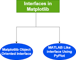
Matplotlib provides two main interfaces for creating visualizations: the pyplot interface and the object-oriented (OOP) interface.
In the previous chapter, we primarily used the pyplot interface — a convenient, MATLAB-style approach where functions such as plt.plot() and plt.xlabel() operate on an implicit current
figure and axes.
The object-oriented (OOP) interface, on the other hand, offers explicit control over every element of your plot. It’s the preferred approach for building complex layouts, multiple subplots, or publication-quality figures where precision and flexibility matter.
12.2.1 Compare Pyplot vs Object-Oriented Interfaces
Let’s create the same plot using both interfaces to see the difference in syntax and approach.
We’ll use a dataset containing GDP and life expectancy data for countries.
# Load the dataset
gdp_data = pd.read_csv('datasets/gdp_lifeExpectancy.csv')
gdp_data.head()| country | continent | year | lifeExp | pop | gdpPercap | |
|---|---|---|---|---|---|---|
| 0 | Afghanistan | Asia | 1952 | 28.801 | 8425333 | 779.445314 |
| 1 | Afghanistan | Asia | 1957 | 30.332 | 9240934 | 820.853030 |
| 2 | Afghanistan | Asia | 1962 | 31.997 | 10267083 | 853.100710 |
| 3 | Afghanistan | Asia | 1967 | 34.020 | 11537966 | 836.197138 |
| 4 | Afghanistan | Asia | 1972 | 36.088 | 13079460 | 739.981106 |
12.2.1.1 Pyplot Interface (Implicit)
# Pyplot interface - operates on the "current" figure/axes
plt.scatter(gdp_data.lifeExp, gdp_data.gdpPercap)
plt.xlabel('Life Expectancy')
plt.ylabel('GDP per Capita')
plt.title('GDP vs Life Expectancy (Pyplot Interface)');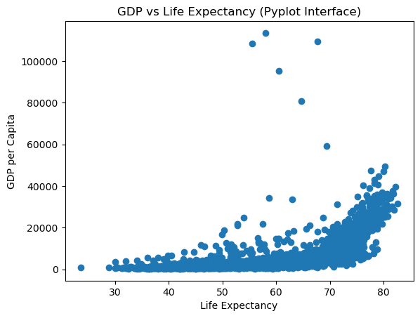
12.2.1.2 Object-Oriented Interface (Explicit)
# Object-oriented interface
fig, ax = plt.subplots() # Create a figure and an axes explicitly
# Plot on the specific axes object
ax.scatter(gdp_data.lifeExp, gdp_data.gdpPercap)
ax.set_xlabel('Life Expectancy')
ax.set_ylabel('GDP per Capita')
ax.set_title('GDP vs Life Expectancy (OOP Interface)');
Key Observations:
Both approaches produce identical plots, but notice the differences:
Pyplot Interface:
- Simpler syntax:
plt.scatter(),plt.xlabel() - Operates on implicit
current
figure - Great for quick, simple plots
- Less control when working with multiple subplots
- Simpler syntax:
Object-Oriented Interface:
- Explicit syntax:
ax.scatter(),ax.set_xlabel() - Direct control over specific axes object
- Essential for complex layouts
- Can pass axes to pandas/seaborn functions
- More verbose but more flexible
- Explicit syntax:
12.2.1.3 Pyplot: A Convenience Wrapper
The pyplot interface (e.g., plt.plot()) is a convenience layer built on top of Matplotlib’s object-oriented (OOP) interface.
Behind the scenes, it:
- Automatically creates a Figure and Axes if they don’t already exist
- Keeps track of the
current
figure and axes
- Routes plotting commands to that current axes object
This makes pyplot extremely convenient for quick, one-off plots or exploratory analysis,
but it can quickly become confusing or limiting when working with multiple figures or subplots.
12.2.1.4 When the OOP Interface Becomes Essential
While pyplot is great for simplicity, the OOP interface (fig, ax = plt.subplots()) is the right choice for:
- Creating multiple subplots within a single figure
- Building complex layouts or publication-quality plots
- Integrating with pandas or seaborn, which both accept an
axparameter — allowing you to specify exactly where a plot should appear (somethingpyplotalone cannot do)
12.2.2 Understand the Matplotlib Object Hierarchy
To work effectively with matplotlib’s OOP interface, you need to understand how plot components are organized.
12.2.2.1 The Hierarchical Structure
Matplotlib plots follow a hierarchical structure, with two core components:
- Figure: The overall container for one or more plots (the entire window/canvas)
- Axes: The individual plot area where data is visualized (what you think of as
a plot
)
Each Axes contains further elements such as:
- Axis (x-axis and y-axis) - the number lines with ticks and labels
- Title, Labels, Ticks - text and markers
- Drawable objects like Lines, Text, and Patches (collectively called Artists)
Here’s the hierarchy visualized:
Figure (the entire canvas)
└── Axes (1 or more plot areas)
├── XAxis, YAxis (the number lines)
│ ├── Axis Labels
│ ├── Tick Marks
│ └── Tick Labels
├── Title
├── Legend
└── Artist objects (Lines, Patches, Text, Collections, etc.)Important Terminology:
- Figure = The entire window/image (can contain multiple plots)
- Axes = A single plot area (confusingly NOT the axis lines!)
- Axis = The x-axis or y-axis number line
Understanding this structure is key to using Matplotlib’s object-oriented interface, as it allows you to access and customize each component directly.
12.2.2.2 Figure: The Top-Level Container
The Figure is an instance of matplotlib.figure.Figure. It is the top level container for all plot elements - think of it as the canvas or paper on which you draw.
Key points about Figure:
- It’s the final image that may contain one or more Axes
- It keeps track of all the Axes, titles, legends, etc.
- You cannot plot data directly on a Figure (only on Axes)
- It controls the overall image size, DPI, background color
Let’s create an empty Figure to see what it looks like:
# Create an empty figure - just the container, no plots yet
fig = plt.figure(figsize=(8, 6))
print(f"Figure object: {fig}")
print(f"Number of axes in figure: {len(fig.axes)}")Figure object: Figure(800x600)
Number of axes in figure: 0<Figure size 800x600 with 0 Axes>Observation: The Figure is just a blank canvas. Creating a figure with plt.figure() does NOT automatically create an axes - that’s why you see an empty rectangle.
12.2.2.3 Axes: The Plot Area
An Axes is an instance of matplotlib.axes.Axes. This is where data are plotted - it’s what you typically think of as a plot
or a graph.
Key points about Axes:
- A Figure can contain many Axes (multiple plots)
- But each Axes belongs to only one Figure
- This is where you call plotting methods like
.plot(),.scatter(),.bar() - Each Axes has its own x-axis, y-axis, title, labels, etc.
Creating Axes:
There are two common ways to add Axes to a Figure:
# Method 1: Create figure first, then add axes
fig = plt.figure(figsize=(8, 4))
ax = fig.add_subplot(1, 1, 1) # Add subplot: (rows, cols, position)
print(f"Created axes: {ax}")
print(f"Figure now has {len(fig.axes)} axes")Created axes: Axes(0.125,0.11;0.775x0.77)
Figure now has 1 axes
Better approach: Use plt.subplots() to create Figure and Axes together:
# Method 2: Create figure and axes in one step (RECOMMENDED)
fig, axes = plt.subplots(2, 2, figsize=(10, 8))
print(f"Created figure with {len(fig.axes)} axes")
print(f"Axes array shape: {axes.shape}")
print(f"Access top-left axes: {axes[0, 0]}")Created figure with 4 axes
Axes array shape: (2, 2)
Access top-left axes: Axes(0.125,0.53;0.352273x0.35)
Note: When you create a 2x2 grid with subplots(2, 2), you get a 2D array of Axes objects. You access them using indexing: axes[row, col].
12.2.3 Create and Customize Plots with the OOP Interface
Now that we understand the hierarchy, let’s create a complete plot using the OOP interface, customizing every component.
12.2.3.1 Components of an Axes Object
The Axes object contains several elements that make up the plot:
- Data plotting area: Contains the actual data visualizations (lines, bars, points, etc.)
- X-axis and Y-axis: Controls axis limits, labels, and ticks
- Title and Labels: The overall title and labels for each axis
- Gridlines: Optional lines to help align data visually
- Spines: The borders around the plot
- Legend: Explains what different data series represent
- Annotations: Text or arrows highlighting points of interest
Let’s create a fully customized plot demonstrating all these components:
# Create sample data
x = np.arange(10)
y = x**2
# Step 1: Create figure and axes
fig, ax = plt.subplots(1, 1, figsize=(10, 6))
# Step 2: Plot the data
ax.plot(x, y, color='blue', linewidth=2, marker='o', markersize=8, label='y = x²')
# Step 3: Set title and labels
ax.set_title("Exponential Growth Pattern", fontsize=16, fontweight='bold')
ax.set_xlabel("Age (years)", fontsize=12)
ax.set_ylabel("Cell Growth (count)", fontsize=12)
# Step 4: Set axis limits
ax.set_xlim([0, 10])
ax.set_ylim([0, 100])
# Step 5: Customize ticks
ax.set_xticks(range(0, 11, 2))
ax.set_yticks(range(0, 101, 20))
# Step 6: Add grid for readability
ax.grid(True, alpha=0.3, linestyle='--')
# Step 7: Add legend
ax.legend(loc="upper left", frameon=True)
# Step 8: Add annotation
ax.annotate('Rapid growth', xy=(7, 49), xytext=(5, 70),
arrowprops=dict(arrowstyle='->', color='red'),
fontsize=10, color='red')
plt.tight_layout()
plt.show()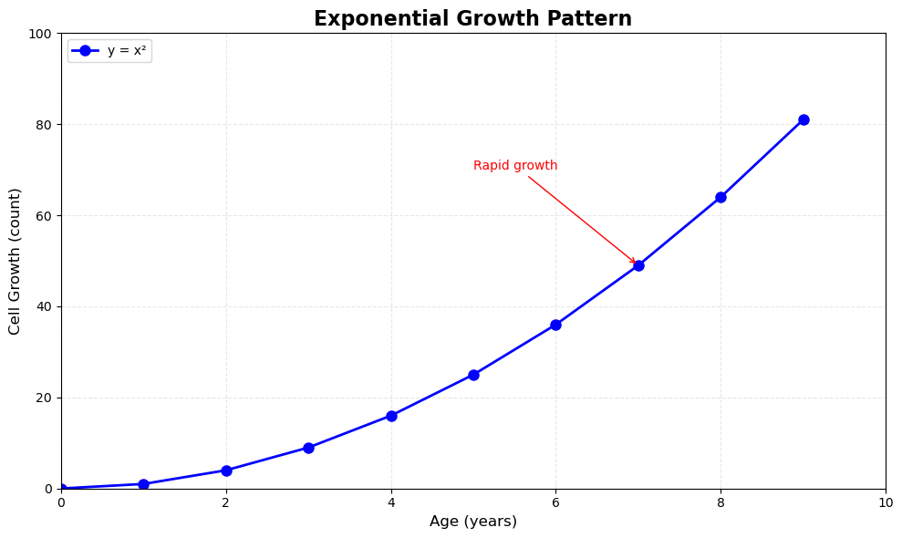
Key Observations:
Notice the pattern in the OOP interface - every customization method starts with ax.set_*() or acts on the axes object:
ax.set_title()- sets titleax.set_xlabel()/ax.set_ylabel()- sets labelsax.set_xlim()/ax.set_ylim()- sets axis limitsax.set_xticks()/ax.set_yticks()- sets tick positionsax.grid()- adds gridlinesax.legend()- adds legendax.annotate()- adds annotations
This explicit control is what makes the OOP interface powerful for complex visualizations.
12.3 Mastering Subplots
Now that you understand matplotlib’s architecture, let’s explore how to create sophisticated multi-panel layouts. Subplots allow you to display multiple related visualizations in a single figure, making comparisons easier and creating comprehensive data stories.
The OOP interface truly shines when you need to work with multiple plots or integrate with other libraries. Here’s why it’s essential:
12.3.1 Types of Subplot Layouts
We’ll cover two main scenarios:
- Non-overlapping subplots - Multiple plots in a grid (most common)
- Nested subplots - Plots inside other plots (for insets and zoomed views)
12.3.2 Create Simple Subplot Grids
The most common use case is arranging multiple plots in a grid pattern. The plt.subplots() function makes this straightforward.
Syntax:
fig, axes = plt.subplots(nrows, ncols, figsize=(width, height))Let’s create a 2x2 grid and understand how to access individual subplots:
# Create a simple 2x2 grid of subplots
fig, axes = plt.subplots(2, 2, figsize=(12, 10))
# Create sample data
x = np.linspace(0, 10, 100)
# Plot in each subplot using array indexing
axes[0, 0].plot(x, np.sin(x))
axes[0, 0].set_title('Sine Wave')
axes[0, 1].plot(x, np.cos(x), color='orange')
axes[0, 1].set_title('Cosine Wave')
axes[1, 0].plot(x, x**2, color='green')
axes[1, 0].set_title('Quadratic')
axes[1, 1].plot(x, np.exp(x/5), color='red')
axes[1, 1].set_title('Exponential')
# Add a main title for the entire figure
fig.suptitle('Four Mathematical Functions', fontsize=16, fontweight='bold')
plt.tight_layout()
plt.show()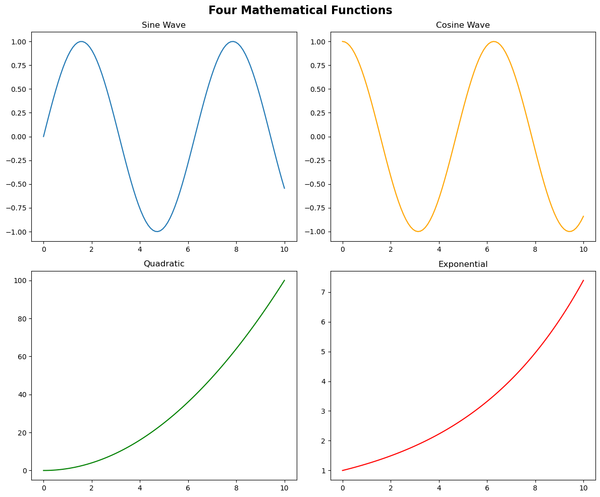
Key Points:
axesis a 2D NumPy array with shape(2, 2)- Access subplots using
axes[row, col](0-indexed) - Each axes is independent - customize titles, labels, colors separately
fig.suptitle()adds a title for the entire figure (not just one subplot)plt.tight_layout()automatically adjusts spacing to prevent overlaps
12.3.3 Control Subplot Layout and Spacing
Proper spacing between subplots is crucial for readability. Let’s explore layout control options.
Layout Control Methods:
plt.tight_layout()- Automatic spacing adjustment (recommended)plt.tight_layout(pad=value)- Control padding between subplotsplt.subplots_adjust()- Manual control over spacingfigsizeparameter - Control overall figure dimensions
12.3.4 Integrate Matplotlib with Pandas and Seaborn
One of the most powerful features of the OOP interface is the ability to pass axes objects to pandas and seaborn plotting functions. This gives you precise control over where each plot appears.
The ax Parameter:
Both pandas and seaborn plotting functions accept an ax parameter:
df.plot(..., ax=axes[0, 0])- pandas plotssns.scatterplot(..., ax=axes[0, 1])- seaborn plots
This allows you to:
- Combine different plot types in one figure
- Mix pandas, seaborn, and matplotlib plotting
- Create complex dashboards with precise layout control
Let’s create a comprehensive visualization using multiple data sources and libraries:
# Load datasets
flowers_df = sns.load_dataset('iris')
tips_df = sns.load_dataset('tips')
flights_df = sns.load_dataset("flights").pivot(index="month", columns="year", values="passengers")
# Create a 2x2 grid
fig, axes = plt.subplots(2, 2, figsize=(14, 10))
# Subplot 1: Seaborn scatter plot
axes[0, 0].set_title('Sepal Length vs Width by Species', fontsize=12, fontweight='bold')
sns.scatterplot(
data=flowers_df,
x='sepal_length',
y='sepal_width',
hue='species',
s=100,
ax=axes[0, 0]
)
# Subplot 2: Pandas histogram
axes[0, 1].set_title('Distribution of Sepal Width', fontsize=12, fontweight='bold')
flowers_df['sepal_width'].plot.hist(bins=20, ax=axes[0, 1], color='skyblue', edgecolor='black')
axes[0, 1].set_xlabel('Sepal Width')
axes[0, 1].set_ylabel('Frequency')
# Subplot 3: Seaborn bar plot
axes[1, 0].set_title('Restaurant Bills by Day and Gender', fontsize=12, fontweight='bold')
sns.barplot(
data=tips_df,
x='day',
y='total_bill',
hue='sex',
ax=axes[1, 0]
)
# Subplot 4: Seaborn heatmap
axes[1, 1].set_title('Flight Traffic Over Time', fontsize=12, fontweight='bold')
sns.heatmap(flights_df, cmap='Blues', ax=axes[1, 1], cbar_kws={'label': 'Passengers'})
# Adjust layout with custom padding
plt.tight_layout(pad=3)
plt.show()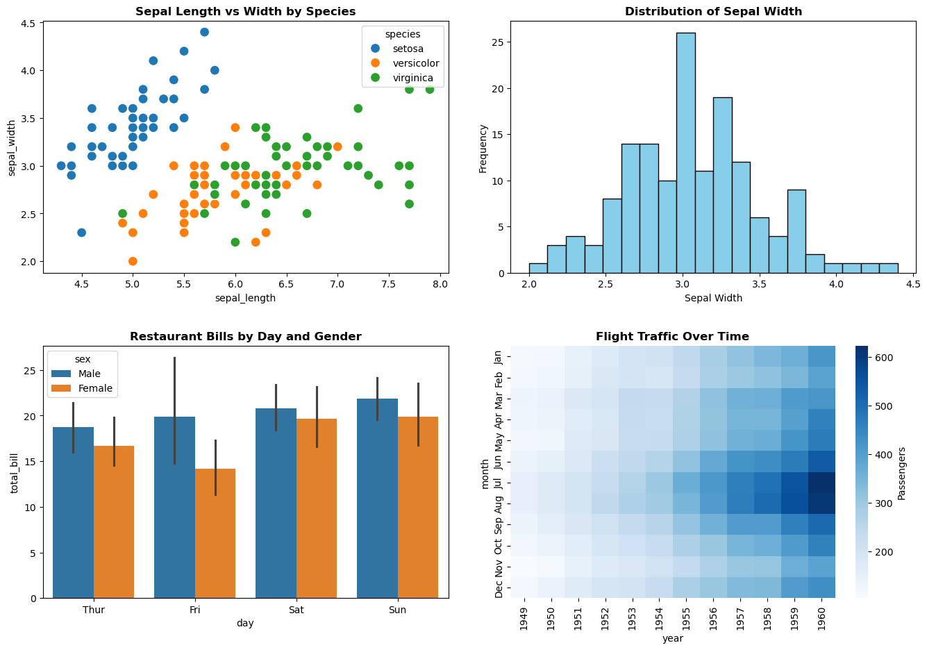
Key Observations:
- Mixed Libraries: We seamlessly combined seaborn scatter plots, pandas histograms, seaborn bar plots, and seaborn heatmaps
- The
axParameter: Every plotting function received a specific axes object (ax=axes[row, col]) - Independent Customization: Each subplot has its own title, labels, and styling
- Layout Control:
tight_layout(pad=3)adds extra padding for readability
Important Notes:
- Seaborn and pandas are wrappers around matplotlib
- They create plots ON the axes you specify via the
axparameter - Without the
axparameter, they would create their own figure/axes - This is why the OOP interface is essential for complex layouts
12.3.5 Create Nested Subplots (Insets)
Sometimes you want to show a detailed view of a specific region within a larger plot. This is called an inset or nested subplot.
Use Cases for Insets:
- Zooming into a specific region of interest
- Showing a histogram or distribution alongside the main plot
- Displaying summary statistics or related analysis
- Creating
picture-in-picture
visualizations
You can create nested subplots using fig.add_axes() or inset_axes().
12.3.5.1 Using add_axes() for Precise Control
Syntax:
ax = fig.add_axes([left, bottom, width, height])Parameters (all are fractions from 0 to 1):
left: Horizontal starting position (0=left edge, 1=right edge)bottom: Vertical starting position (0=bottom edge, 1=top edge)width: Width as fraction of figure widthheight: Height as fraction of figure height
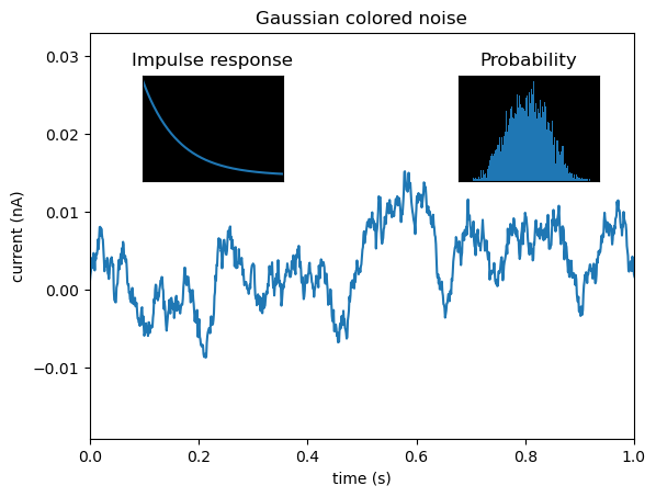
Let’s create a plot with two inset plots showing related information:
# Set random seed for reproducibility
np.random.seed(19680801)
# Create colored noise data
dt = 0.001
t = np.arange(0.0, 10.0, dt)
r = np.exp(-t[:1000] / 0.05) # Impulse response
x = np.random.randn(len(t))
s = np.convolve(x, r)[:len(x)] * dt # Colored noise
# Create the main figure and axes
fig, main_ax = plt.subplots(figsize=(12, 6))
# Plot main data
main_ax.plot(t, s, linewidth=0.5)
main_ax.set_xlim(0, 1)
main_ax.set_ylim(1.1 * np.min(s), 2 * np.max(s))
main_ax.set_xlabel('Time (s)', fontsize=12)
main_ax.set_ylabel('Current (nA)', fontsize=12)
main_ax.set_title('Gaussian Colored Noise with Inset Analysis', fontsize=14, fontweight='bold')
# Create right inset showing probability distribution
# [left, bottom, width, height] as fractions of figure
right_inset_ax = fig.add_axes([0.65, 0.6, 0.2, 0.25], facecolor='lightgray')
right_inset_ax.hist(s, 400, density=True, color='steelblue', alpha=0.7)
right_inset_ax.set_title('Probability Distribution', fontsize=9)
right_inset_ax.set_xticks([])
right_inset_ax.set_yticks([])
# Create left inset showing impulse response
left_inset_ax = fig.add_axes([0.15, 0.6, 0.2, 0.25], facecolor='lightgray')
left_inset_ax.plot(t[:len(r)], r, color='darkred', linewidth=2)
left_inset_ax.set_title('Impulse Response', fontsize=9)
left_inset_ax.set_xlim(0, 0.2)
left_inset_ax.set_xticks([])
left_inset_ax.set_yticks([])
plt.show()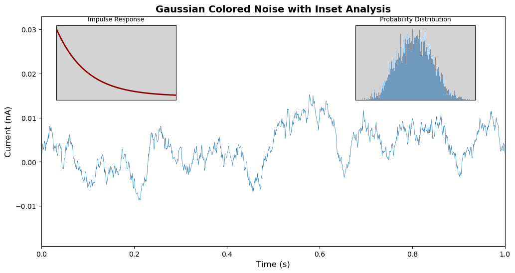
Understanding the Inset Positions:
- Right Inset
[0.65, 0.6, 0.2, 0.25]:- Starts 65% from left edge
- Starts 60% from bottom edge
- Width is 20% of figure width
- Height is 25% of figure height
- Left Inset
[0.15, 0.6, 0.2, 0.25]:- Starts 15% from left edge
- Same vertical position and size as right inset
Tips for Insets:
- Use
facecolorto distinguish insets from main plot - Remove ticks (
set_xticks([])) to reduce clutter - Keep inset titles short and informative
- Position insets where they don’t obscure important data
- Consider using
inset_axes()frommpl_toolkits.axes_grid1for more flexible positioning
12.3.6 Advanced Formatting with Custom Tick Formatters
When creating professional visualizations, you often need to format axis labels for readability. This is especially important for:
- Large numbers (adding commas or using K/M notation)
- Currency values (adding $ or other symbols)
- Percentages
- Dates and times
- Scientific notation
The OOP interface provides powerful formatting capabilities through the yaxis and xaxis objects.
12.3.6.1 Example: Formatting Large Numbers with Commas
Let’s visualize noise complaint data with properly formatted axis labels:
# Load noise complaint data
nyc_party_complaints = pd.read_csv('datasets/party_nyc.csv')
nyc_party_complaints.head()| Created Date | Closed Date | Location Type | Incident Zip | City | Borough | Latitude | Longitude | Hour_of_the_day | Month_of_the_year | |
|---|---|---|---|---|---|---|---|---|---|---|
| 0 | 12/31/2015 0:01 | 12/31/2015 3:48 | Store/Commercial | 10034.0 | NEW YORK | MANHATTAN | 40.866183 | -73.918930 | 0 | 12 |
| 1 | 12/31/2015 0:02 | 12/31/2015 4:36 | Store/Commercial | 10040.0 | NEW YORK | MANHATTAN | 40.859324 | -73.931237 | 0 | 12 |
| 2 | 12/31/2015 0:03 | 12/31/2015 0:40 | Residential Building/House | 10026.0 | NEW YORK | MANHATTAN | 40.799415 | -73.953371 | 0 | 12 |
| 3 | 12/31/2015 0:03 | 12/31/2015 1:53 | Residential Building/House | 11231.0 | BROOKLYN | BROOKLYN | 40.678285 | -73.994668 | 0 | 12 |
| 4 | 12/31/2015 0:05 | 12/31/2015 3:49 | Residential Building/House | 10033.0 | NEW YORK | MANHATTAN | 40.850304 | -73.938516 | 0 | 12 |
Now let’s create a bar plot showing complaint locations, with properly formatted y-axis labels:
# Create bar plot using pandas (returns axes object)
ax = nyc_party_complaints['Location Type'].value_counts().plot.bar(
ylabel='Number of Complaints',
xlabel='Location Type',
figsize=(10, 6),
color='steelblue'
)
# Format y-axis to add commas to large numbers
ax.yaxis.set_major_formatter('{x:,.0f}')
# Customize the plot
ax.set_title('Noise Complaints by Location Type (NYC 2016)', fontsize=14, fontweight='bold')
ax.set_xticklabels(ax.get_xticklabels(), rotation=45, ha='right')
plt.tight_layout()
plt.show()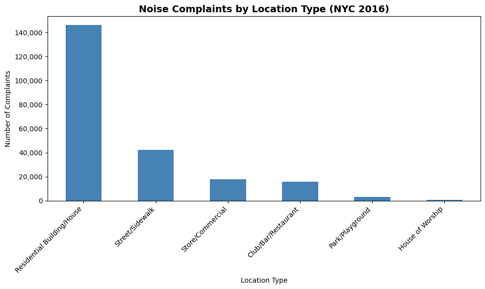
Key Technique - Custom Axis Formatting:
ax.yaxis.set_major_formatter('{x:,.0f}')This uses Python’s format specification mini-language:
{x:,.0f}- Format as float with comma separators and 0 decimal places{x:,.2f}- Two decimal places with commas{x:.2%}- Percentage with 2 decimal places${x:,.0f}- Currency format
Observations:
- Most complaints come from residential buildings and houses (as expected for party/music noise)
- The y-axis now shows
1,000
instead of1000
- much easier to read! - Pandas
.plot.bar()returns an axes object that we can further customize - We rotated x-axis labels 45° for better readability using
set_xticklabels()
This demonstrates how pandas plotting (convenience) and matplotlib OOP (control) work together seamlessly.
12.4 Creating Subplots with Seaborn
We previously demonstrated how Seaborn integrates seamlessly with Matplotlib’s object-oriented interface, allowing you to pass the ax argument to any Seaborn function, thereby directing the plot to a specific axis within a subplot grid.
Additionally, Seaborn offers a more convenient and simplified approach to creating subplots, thanks to its high-level functions and built-in integration with Matplotlib. Here’s how Seaborn makes working with subplots easier:
12.4.1 Using Facetgrid
Seaborn’s FacetGrid is a powerful tool for creating small multiples - grids of plots where each subplot shows a subset of your data based on categorical variables.
Why Use FacetGrid?
- Automatically creates subplot grids based on data categories
- Much easier than manually creating subplots and filtering data
- Ideal for comparing patterns across different groups
- Enables exploration of multi-dimensional relationships
Key Parameters:
data: DataFrame to visualizecol: Variable to create column-wise subplotsrow: Variable to create row-wise subplotshue: Variable for color-coding within each subplotcol_wrap: Wrap columns after this many plots
Let’s explore with the tips dataset:
# Seaborn Example using FacetGrid:
tips_df = sns.load_dataset("tips")
tips_df.head()| total_bill | tip | sex | smoker | day | time | size | |
|---|---|---|---|---|---|---|---|
| 0 | 16.99 | 1.01 | Female | No | Sun | Dinner | 2 |
| 1 | 10.34 | 1.66 | Male | No | Sun | Dinner | 3 |
| 2 | 21.01 | 3.50 | Male | No | Sun | Dinner | 3 |
| 3 | 23.68 | 3.31 | Male | No | Sun | Dinner | 2 |
| 4 | 24.59 | 3.61 | Female | No | Sun | Dinner | 4 |
g = sns.FacetGrid(tips_df, col='time', row='smoker')
g.map(sns.histplot, 'total_bill', color='r')
g.set_titles(col_template="{col_name}", row_template="Smoker: {row_name}");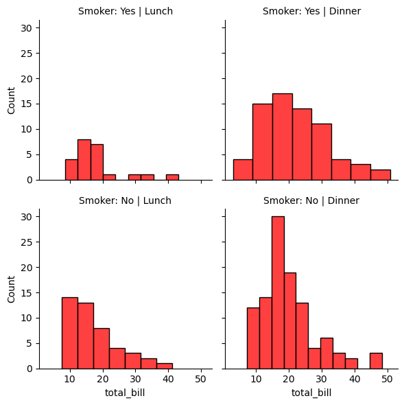
# adding hue to the FacetGrid
g = sns.FacetGrid(tips_df, col='time', row='smoker',hue='size')
# Plot a scatterplot of the total bill and tip for each combination of time and smoker
g.map(sns.scatterplot, 'total_bill', 'tip')
g.set_titles(col_template="{col_name}", row_template="Smoker: {row_name}");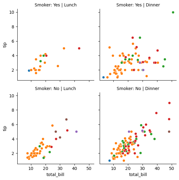
12.4.2 Using Pairplot
Pairplots are used to visualize the association between all variable-pairs in the data. In other words, pairplots simultaneously visualize the scatterplots between all variable-pairs.
Let us visualize the pair-wise association of tips variables in the tips dataset
sns.pairplot(tips_df );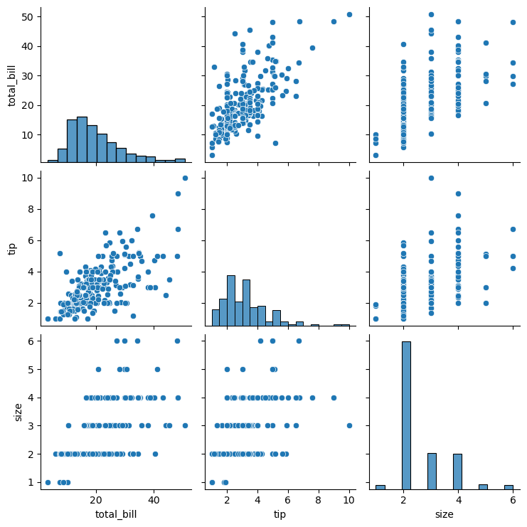
Let us visualize the pair-wise association of nutrition variables in the starbucks drinks data.
starbucks_drinks = pd.read_csv('datasets/starbucks-menu-nutrition-drinks.csv')
sns.pairplot(starbucks_drinks);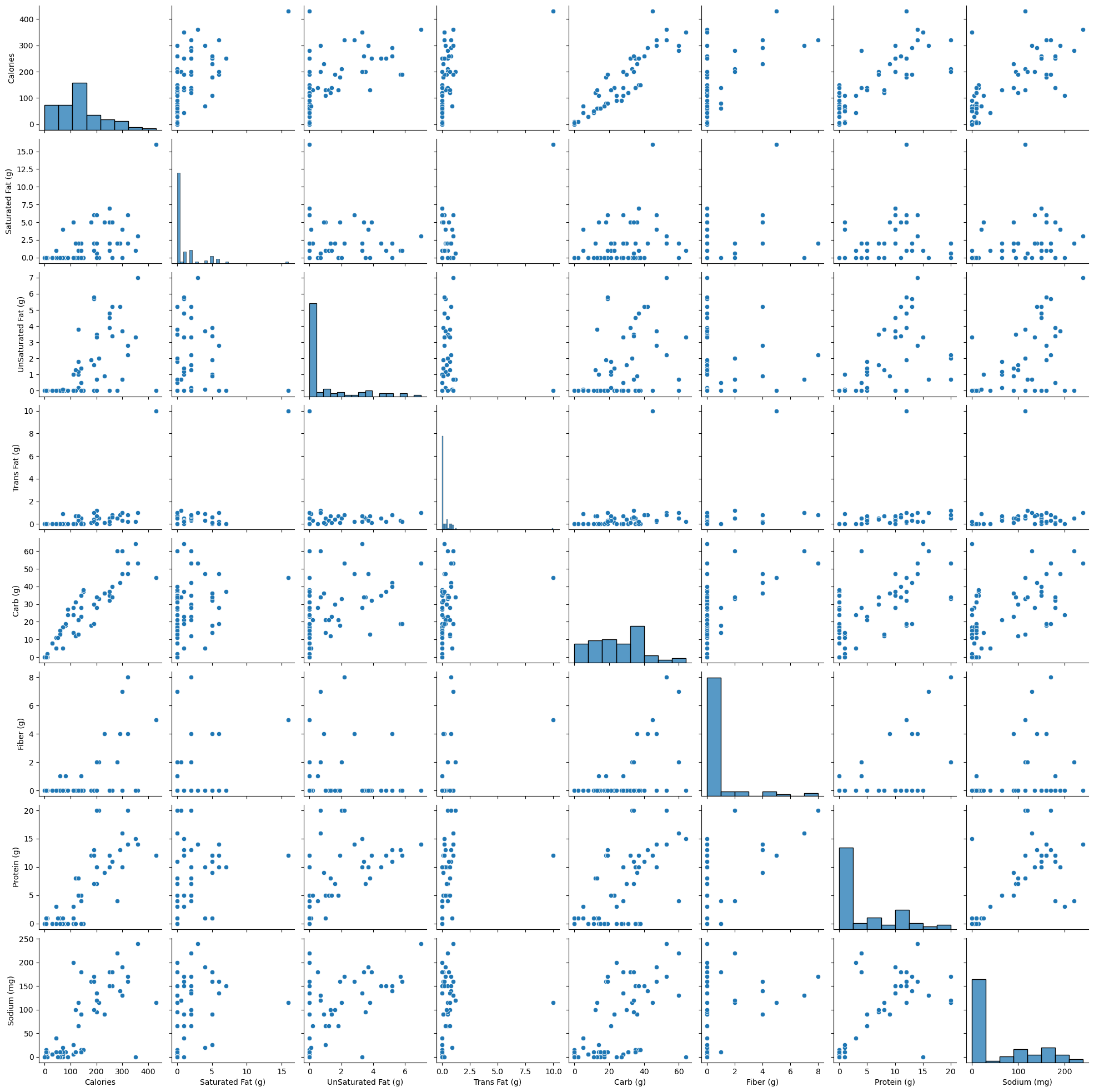
In the above pairplot, note that:
- The histograms on the diagonal of the grid show the distribution of each of the variables.
- Instead of a histogram, we can visualize the density plot with the argument kde = True.
- The scatterplots in the rest of the grid are the pair-wise plots of all the variables.
12.5 Geosptial Plotting
There are several widely used Python packages pecifically designed for working with geospatial datasets. In this lesson, we will cover:
- GeoPandas
- Folium
Let’s import them
import warnings
# Suppress all non-critical warnings
warnings.filterwarnings("ignore")
import geopandas as gpd
import geopandas
import folium
import geodatasets12.5.1 Static Plots with GeoPandas
A shapefile is a widely-used format for storing geographic information system (GIS) data, specifically vector data. It contains geometries (like points, lines, and polygons) that represent features on the earth’s surface, along with associated attributes for each feature, such as names, populations, or other data relevant to the feature.
12.5.1.1 Components of a Shapefile
A shapefile isn’t a single file but a collection of files with the same name and different extensions, which work together to store geographic and attribute data:
.shp: Stores the geometry (shapes of features, like points, lines, polygons)..shx: Contains an index to quickly access geometries in the .shp file..dbf: A table storing attributes associated with each feature.
There may also be other optional files (e.g., .prj for projection information).
# Create figure and axis
fig, ax = plt.subplots(figsize=(15, 10))
# Plot your GeoDataFrame
chicago = gpd.read_file(r'datasets/chicago_boundaries\geo_export_26bce2f2-c163-42a9-9329-9ca6e082c5e9.shp')
chicago.plot(column='community', ax=ax, legend=True, legend_kwds={'ncol': 2, 'bbox_to_anchor': (2, 1)})
# Add title (optional)
plt.title('Chicago Community Areas');
Let’s print out the information in the shapefile
chicago.head()| area | area_num_1 | area_numbe | comarea | comarea_id | community | perimeter | shape_area | shape_len | geometry | |
|---|---|---|---|---|---|---|---|---|---|---|
| 0 | 0.0 | 35 | 35 | 0.0 | 0.0 | DOUGLAS | 0.0 | 4.600462e+07 | 31027.054510 | POLYGON ((-87.60914 41.84469, -87.60915 41.844... |
| 1 | 0.0 | 36 | 36 | 0.0 | 0.0 | OAKLAND | 0.0 | 1.691396e+07 | 19565.506153 | POLYGON ((-87.59215 41.81693, -87.59231 41.816... |
| 2 | 0.0 | 37 | 37 | 0.0 | 0.0 | FULLER PARK | 0.0 | 1.991670e+07 | 25339.089750 | POLYGON ((-87.6288 41.80189, -87.62879 41.8017... |
| 3 | 0.0 | 38 | 38 | 0.0 | 0.0 | GRAND BOULEVARD | 0.0 | 4.849250e+07 | 28196.837157 | POLYGON ((-87.60671 41.81681, -87.6067 41.8165... |
| 4 | 0.0 | 39 | 39 | 0.0 | 0.0 | KENWOOD | 0.0 | 2.907174e+07 | 23325.167906 | POLYGON ((-87.59215 41.81693, -87.59215 41.816... |
chicago['geometry'].head()0 POLYGON ((-87.60914 41.84469, -87.60915 41.844...
1 POLYGON ((-87.59215 41.81693, -87.59231 41.816...
2 POLYGON ((-87.6288 41.80189, -87.62879 41.8017...
3 POLYGON ((-87.60671 41.81681, -87.6067 41.8165...
4 POLYGON ((-87.59215 41.81693, -87.59215 41.816...
Name: geometry, dtype: geometry# Check the column names to see available data fields
print("Columns in the shapefile:", chicago.columns)
# Check the data types of each column
print("Data types:", chicago.dtypes)
# View the spatial extent (bounding box) of the shapes
print("Bounding box:", chicago.total_bounds)
# Check the coordinate reference system (CRS)
print("CRS:", chicago.crs)Columns in the shapefile: Index(['area', 'area_num_1', 'area_numbe', 'comarea', 'comarea_id',
'community', 'perimeter', 'shape_area', 'shape_len', 'geometry'],
dtype='object')
Data types: area float64
area_num_1 object
area_numbe object
comarea float64
comarea_id float64
community object
perimeter float64
shape_area float64
shape_len float64
geometry geometry
dtype: object
Bounding box: [-87.94011408 41.64454312 -87.5241371 42.02303859]
CRS: EPSG:4326To enhance the geospatial plot, we’ll use the shapefile as a background to provide context for Chicago’s community areas. On top of that, we’ll layer points of interest, such as restaurants, and shops, to illustrate the city’s amenities. This approach will make the map more informative and visually engaging, with community boundaries as the foundation and key locations overlayed to highlight areas of interest.
Next, we will add the Divvy bicycle stations on top of the chicago shapefile
12.5.2 Dataset: Bicycle Sharing in Chicago

Divvy is Chicagoland’s bike share system (in collaboration with Chicago Department of Transportation), with 6,000 bikes available at 570+ stations across Chicago and Evanston. Divvy provides residents and visitors with a convenient, fun and affordable transportation option for getting around and exploring Chicago.
Divvy, like other bike share systems, consists of a fleet of specially designed, sturdy and durable bikes that are locked into a network of docking stations throughout the region. The bikes can be unlocked from one station and returned to any other station in the system. People use bike share to explore Chicago, commute to work or school, run errands, get to appointments or social engagements, and more.
Divvy is available for use 24 hours/day, 7 days/week, 365 days/year, and riders have access to all bikes and stations across the system.
We will be using divvy trips in the year of 2013
# read the csv file'divvy_2013.csv' into pandas pandas dataframe
data = pd.read_csv('datasets/divvy_2013.csv')
data.head()| trip_id | usertype | gender | starttime | stoptime | tripduration | from_station_id | from_station_name | latitude_start | longitude_start | ... | dewpoint | humidity | pressure | visibility | wind_speed | precipitation | events | rain | conditions | month | |
|---|---|---|---|---|---|---|---|---|---|---|---|---|---|---|---|---|---|---|---|---|---|
| 0 | 3940 | Subscriber | Male | 2013-06-27 01:06:00 | 2013-06-27 09:46:00 | 31177 | 91 | Clinton St & Washington Blvd | 41.88338 | -87.641170 | ... | 64.9 | 96.0 | 29.75 | 7.0 | 0.0 | -9999.0 | partlycloudy | 0 | Scattered Clouds | 6 |
| 1 | 4095 | Subscriber | Male | 2013-06-27 12:06:00 | 2013-06-27 12:11:00 | 301 | 85 | Michigan Ave & Oak St | 41.90096 | -87.623777 | ... | 69.1 | 55.0 | 29.75 | 10.0 | 13.8 | -9999.0 | mostlycloudy | 0 | Mostly Cloudy | 6 |
| 2 | 4113 | Subscriber | Male | 2013-06-27 11:09:00 | 2013-06-27 11:11:00 | 140 | 88 | May St & Randolph St | 41.88397 | -87.655688 | ... | 70.0 | 61.0 | 29.75 | 10.0 | 10.4 | -9999.0 | mostlycloudy | 0 | Mostly Cloudy | 6 |
| 3 | 4118 | Customer | NaN | 2013-06-27 12:11:00 | 2013-06-27 12:16:00 | 316 | 85 | Michigan Ave & Oak St | 41.90096 | -87.623777 | ... | 69.1 | 55.0 | 29.75 | 10.0 | 13.8 | -9999.0 | mostlycloudy | 0 | Mostly Cloudy | 6 |
| 4 | 4119 | Subscriber | Male | 2013-06-27 11:12:00 | 2013-06-27 11:13:00 | 87 | 88 | May St & Randolph St | 41.88397 | -87.655688 | ... | 70.0 | 61.0 | 29.75 | 10.0 | 10.4 | -9999.0 | mostlycloudy | 0 | Mostly Cloudy | 6 |
5 rows × 28 columns
In the Divvy dataset, each trip record includes the latitude and longitude coordinates of both the pickup and drop-off locations, which correspond to Divvy bike stations. These coordinates allow us to map the precise locations of each station, making it possible to visually display the network of Divvy stations across the city. By plotting these stations on a map, we can better understand the geographic distribution and accessibility of Divvy’s bike-sharing network.
Below are the basic data cleaning steps to extract the coordinates of the Divvy stations.
# drop the duplicates in the column 'to_station_id', 'to_station_name', 'latitude_end', 'longitude_end'
# data_station_same = data[['from_station_id', 'from_station_name', 'latitude_start', 'longitude_start', 'to_station_id', 'to_station_name', 'latitude_end', 'longitude_end']].drop_duplicates()
# data_station_same.shape12.5.3 Adding the divvy station to the plot
Once the coordinates are prepared, we’ll add them as scatter plots on top of the Chicago shapefile
# Adding the stations to the plot
fig, ax = plt.subplots(figsize=(15, 10))
chicago = gpd.read_file(r'datasets/chicago_boundaries\geo_export_26bce2f2-c163-42a9-9329-9ca6e082c5e9.shp')
chicago.plot(column='community', ax=ax, legend=True, legend_kwds={'ncol': 2, 'bbox_to_anchor': (2, 1)})
# Plot the stations
longlat_df = data[[ 'latitude_start', 'longitude_start']].drop_duplicates()
plt.scatter(longlat_df['longitude_start'], longlat_df['latitude_start'], s=10, alpha=0.5, color='black', marker='o')
# Add title (optional)
plt.title('Chicago Community Areas');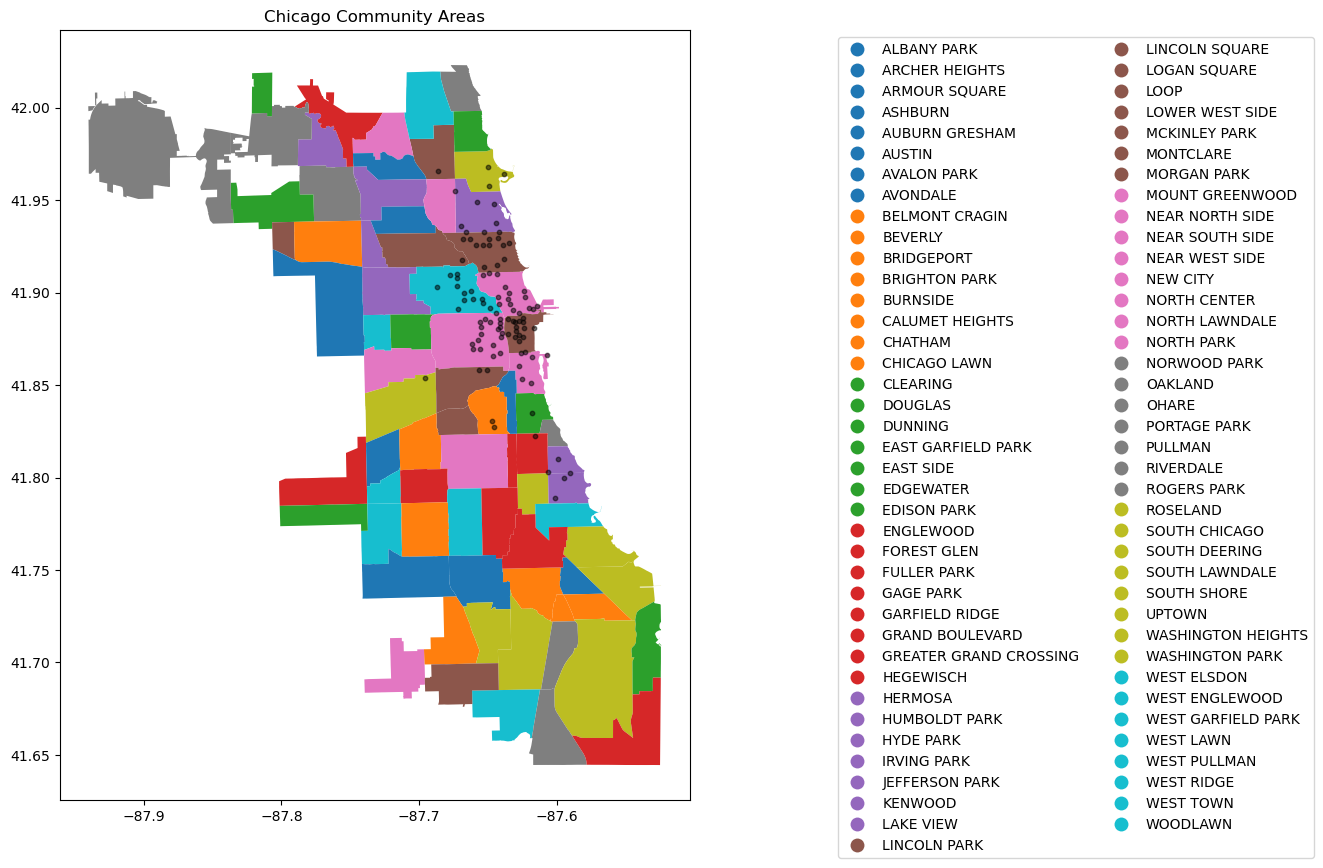
12.5.4 Change the chicago shapefile
Using a different Chicago shapefile from GeoDa is a great way to observe how geographic boundaries or data details may vary
chicago = gpd.read_file(geodatasets.get_path("geoda.chicago_commpop"))
# Plot the data
fig, ax = plt.subplots(figsize=(15, 10))
chicago.boundary.plot(ax=ax)
plt.scatter(data['longitude_start'], data['latitude_start'], s=10, alpha=0.5, color='black', marker='o')
plt.title('Chicago Community Areas');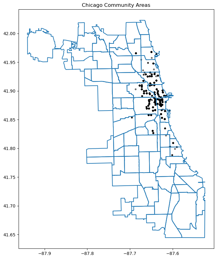
12.5.5 Interactive Plotting
Alongside static plots, geopandas can create interactive maps based on the folium library.
Creating maps for interactive exploration mirrors the API of static plots in an explore() method of a GeoSeries or GeoDataFrame.
Here’s an explanation of how explore() works and its key features:
Key Features of explore():
Interactive Map Display:
- When you call explore() on a Geodataframe (gdf), it launches an interactive map widget directly within your Jupyter notebook.
- This map allows you to pan, zoom, and interact with the geometries (points, lines, polygons) in your Geodataframe.
Layer Control:
- explore() automatically adds the geometries from your Geodataframe as layers on the map.
- Each geometry type (points, lines, polygons) is displayed with appropriate styling and markers.
Tooltip Information:
- When you hover over a geometry in the map, explore() displays tooltip information that typically includes attribute data associated with that geometry.
- This feature is useful for inspecting specific details or properties of individual features in your geospatial dataset.
Search and Filter:
- explore() provides basic search and filter functionalities directly on the map.
- You can search for specific attribute values or filter the displayed features based on attribute criteria defined in your Geodataframe.
Customization:
- Although explore() provides default styling and interaction behaviors, you can customize the map further using parameters or by manipulating the Geodataframe before calling explore().
# use the geopandas explore default settings
chicago = gpd.read_file(geodatasets.get_path("geoda.chicago_commpop"))
m = chicago.explore()
display(m)Make this Notebook Trusted to load map: File -> Trust Notebook
Adding the population layer
import os
os.environ["OMP_NUM_THREADS"] = "1"
# Customerize the explore settings
chicago = gpd.read_file(geodatasets.get_path("geoda.chicago_commpop"))
m = chicago.explore(
column="POP2010", # make choropleth based on "POP2010" column
scheme="naturalbreaks", # use mapclassify's natural breaks scheme
legend=True, # show legend
k=10, # use 10 bins
tooltip=False, # hide tooltip
popup=["POP2010", "POP2000"], # show popup (on-click)
legend_kwds=dict(colorbar=False), # do not use colorbar
name="chicago", # name of the layer in the map
)
mMake this Notebook Trusted to load map: File -> Trust Notebook
The explore() method returns a folium.Map object, which can also be passed directly (as you do with ax in plot()). You can then use folium functionality directly on the resulting map. Next, let’s add the divvy station plot.
type(m)folium.folium.Map12.5.6 Adding the divvy station on the interactive Folium.Map
We need to extract the station information from the trip dataset and add description to the station. You can skip this part
# Helper function for adding the description to the station
def row_to_html(row):
row_df = pd.DataFrame(row).T
row_df.columns = [col.capitalize() for col in row_df.columns]
return row_df.to_html(index=False)# Extracting the latitude, longitude, and station name for plotting, and also counting the number of trips from each station
grouped_df = data.groupby(['from_station_name', 'latitude_start', 'longitude_start'])['trip_id'].count().reset_index()
display(grouped_df.sort_values('trip_id', ascending=False).head())
grouped_df.rename(columns={'from_station_name':'title', 'latitude_start':'latitude', 'longitude_start':'longitude', 'trip_id':'count'}, inplace=True)
grouped_df['description'] = grouped_df.apply(lambda row: row_to_html(row), axis=1)
geometry = gpd.points_from_xy(grouped_df['longitude'], grouped_df['latitude'])
geo_df = gpd.GeoDataFrame(grouped_df, geometry=geometry)
# Optional: Assign Coordinate Reference System (CRS)
geo_df.crs = "EPSG:4326" # WGS84 coordinate system
geo_df.head()| from_station_name | latitude_start | longitude_start | trip_id | |
|---|---|---|---|---|
| 75 | Millennium Park | 41.881032 | -87.624084 | 207 |
| 54 | Lake Shore Dr & Monroe St | 41.881050 | -87.616970 | 191 |
| 72 | Michigan Ave & Oak St | 41.900960 | -87.623777 | 186 |
| 68 | McClurg Ct & Illinois St | 41.891020 | -87.617300 | 177 |
| 73 | Michigan Ave & Pearson St | 41.897660 | -87.623510 | 127 |
| title | latitude | longitude | count | description | geometry | |
|---|---|---|---|---|---|---|
| 0 | Aberdeen St & Jackson Blvd | 41.877726 | -87.654787 | 28 | <table border="1" class="dataframe">\n <thead... | POINT (-87.65479 41.87773) |
| 1 | Aberdeen St & Madison St | 41.881487 | -87.654752 | 28 | <table border="1" class="dataframe">\n <thead... | POINT (-87.65475 41.88149) |
| 2 | Adler Planetarium | 41.866095 | -87.607267 | 6 | <table border="1" class="dataframe">\n <thead... | POINT (-87.60727 41.8661) |
| 3 | Ashland Ave & Armitage Ave | 41.917859 | -87.668919 | 20 | <table border="1" class="dataframe">\n <thead... | POINT (-87.66892 41.91786) |
| 4 | Ashland Ave & Augusta Blvd | 41.899643 | -87.667700 | 27 | <table border="1" class="dataframe">\n <thead... | POINT (-87.6677 41.89964) |
We can add a hover tooltip (sometimes referred to as a tooltip or tooltip popup) for each point on your Folium map. This tooltip will appear when you hover over the markers on the map, providing additional information without needing to click on them. Here’s how you can modify your existing code to include hover tooltips:
chicago = gpd.read_file(geodatasets.get_path("geoda.chicago_commpop"))
m = chicago.explore(
column="POP2010", # make choropleth based on "POP2010" column
scheme="naturalbreaks", # use mapclassify's natural breaks scheme
legend=True, # show legend
k=10, # use 10 bins
tooltip=False, # hide tooltip
popup=["POP2010", "POP2000"], # show popup (on-click)
legend_kwds=dict(colorbar=False), # do not use colorbar
name="chicago", # name of the layer in the map
)
geo_df.explore(
m=m, # pass the map object
color="red", # use red color on all points
marker_kwds=dict(radius=5, fill=True), # make marker radius 10px with fill
tooltip="description", # show "name" column in the tooltip
tooltip_kwds=dict(labels=False), # do not show column label in the tooltip
name="divstation", # name of the layer in the map
)
mMake this Notebook Trusted to load map: File -> Trust Notebook
12.6 Independent Study
12.6.1 Practice exercise 1
Read survey_data_clean.csv
12.6.1.1
Is NU_GPA associated with parties_per_month? Analyze the association separately for Sophomores, Juniors, and Seniors (categories of the variable school_year). Make scatterplots of NU_GPA vs parties_per_month in a 1 x 3 grid, where each grid is for a distinct school_year. Plot the trendline as well for each scatterplot. Use the file survey_data_clean.csv.
12.6.1.2
Capping the the values of parties_per_month to 30, and make the visualizations again.